Anyone who has ever dabbled or worked with digital graphics will have come across the wonder known as a graphics tablet. Whether with a screen or an opaque surface, it is an indispensable creation tool that has saved many a wrist from irreparable injury. There was a time when Wacom was the only name in this biz, but new brands have come up to challenge the champion in features as well as in price. Despite the growth of that market, however, the design of graphics or drawing tablets seem to have been frozen in the past, set in stone by some unknown convention that dictated everything had to be black, boring, and, to be blunt, unappealing. It is a rather ironic state of affairs, but someone finally thought of designing a designer’s tool that looks like it was actually designed by a designer.
Designer: Bous Studio, Studio Alpeto

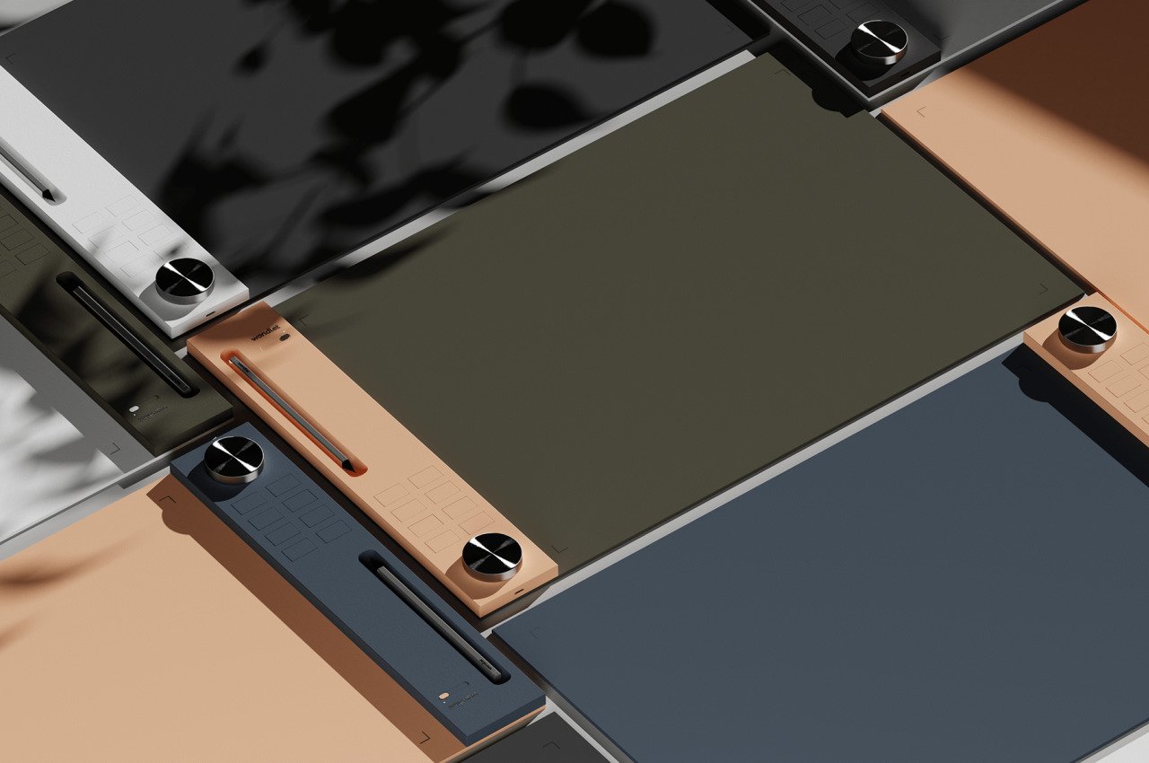
They say that the best tools are the ones that disappear, which is to say that they don’t get in your way by being in your face. The traditional design of graphics tablets seems to adhere to that philosophy by being nondescript and plain, but it actually gets in the way in some other sense. Most of them are designed to be ergonomic, that is true (though there are definitely some exceptions), but they also seem to be uninspired and downright banal as well. For designers that take great pride in how beautiful their pens and stationery look, it’s disappointing that a keyboard and mouse would look more attractive and better designed than a tool specifically aimed at artists, designers, and creators.
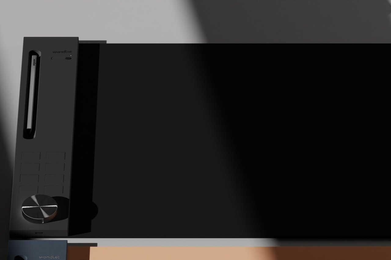
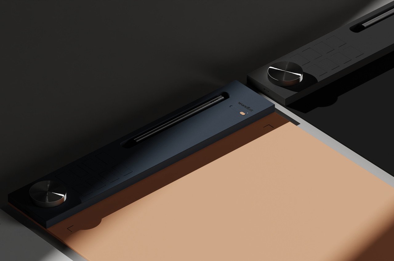
The Wondlet concept breaks out of the mold to present a graphics tablet that designers and artists would be proud to flaunt on their desks. Save for a few parts, the concept doesn’t seem to diverge too far from the typical materials used in graphics tablets. It will most likely still be made mostly from plastic, save for what looks like an aluminum knob, but it adds some splash of color and adds interesting shapes that would better appeal to a designer’s sense of aesthetics.
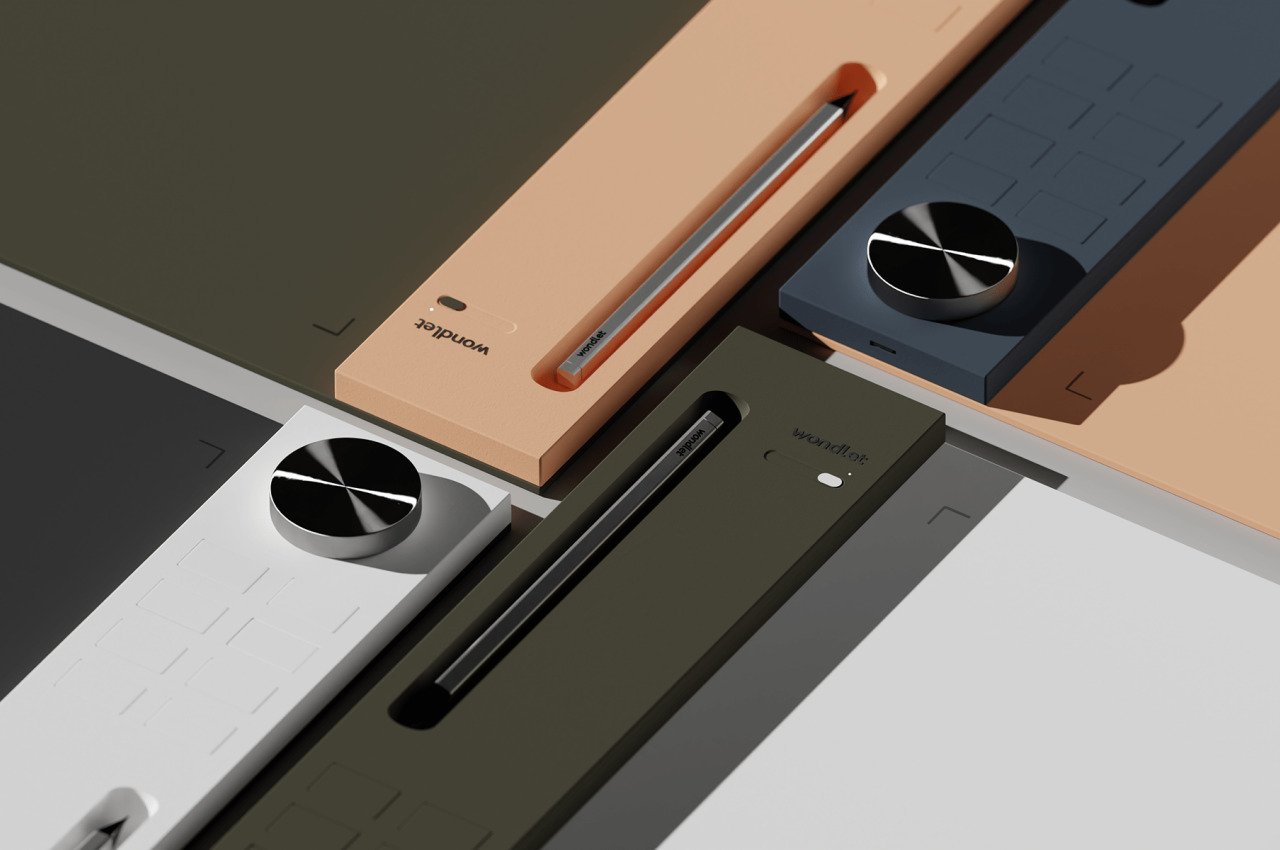
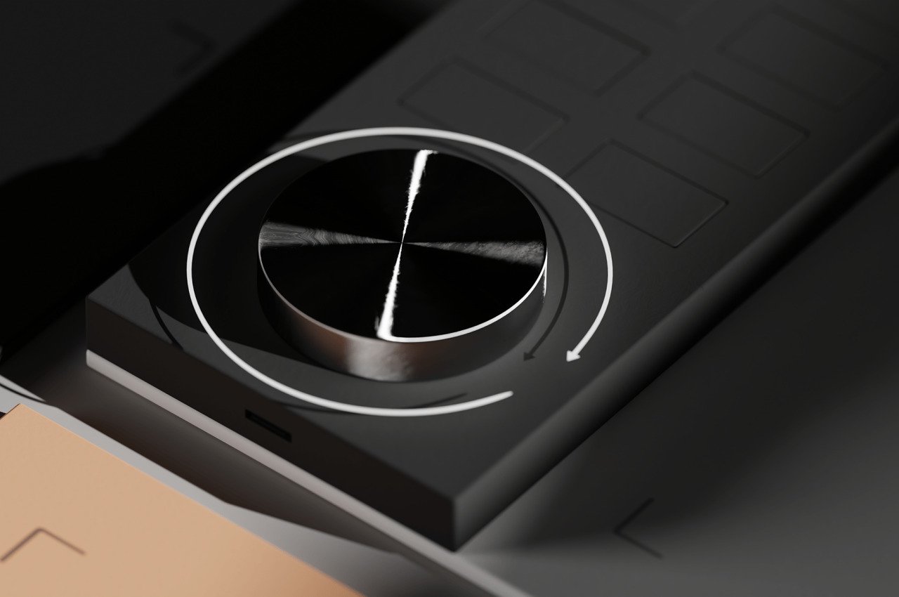
It doesn’t change any existing functionality or even add to them. Save for the dial, which still isn’t a staple in drawing tablets, everything is still there, including the buttons that can be mapped to shortcuts on the computer. Those buttons are flatter than traditional tablet designs, but they’re not completely flushed either, leaving room for haptic feedback and muscle memory.

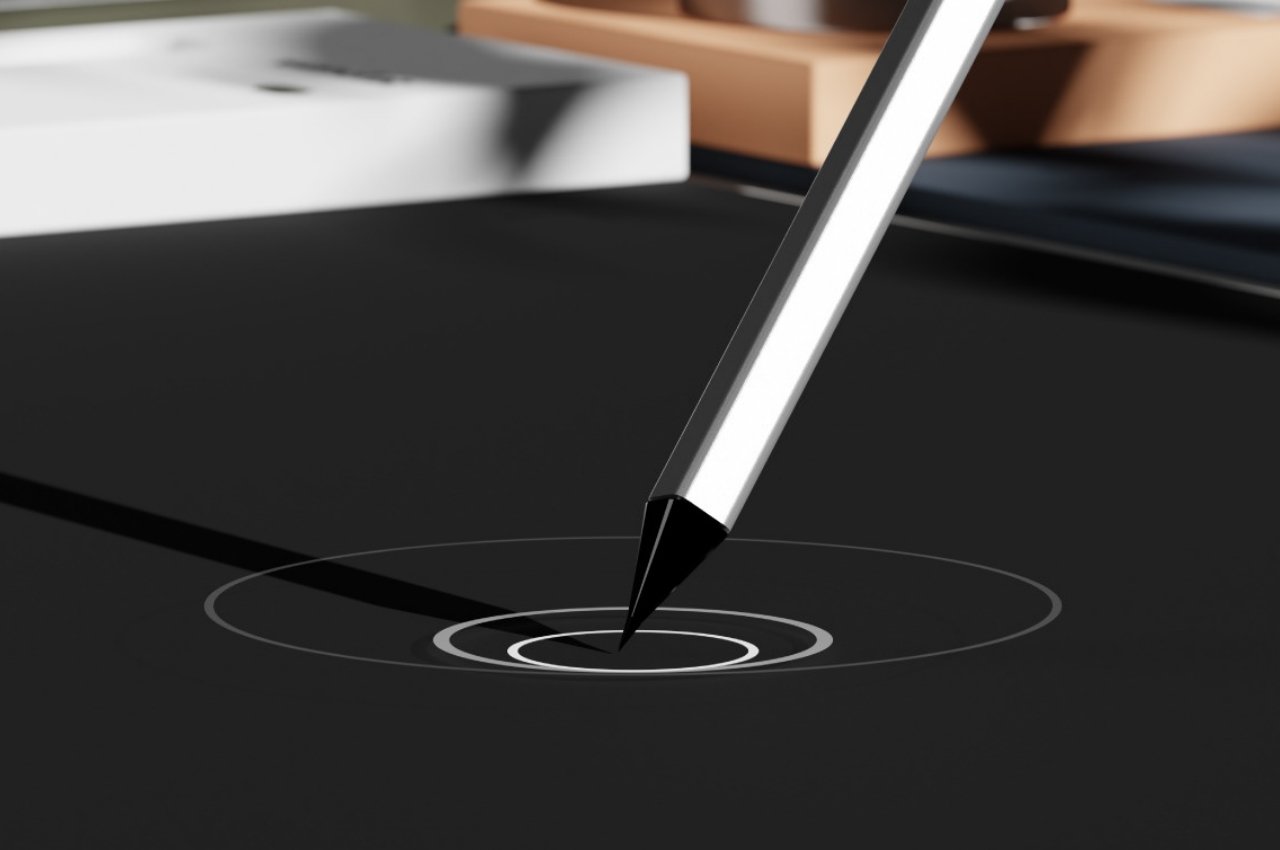
The stylus looks different, though, and could prove to be the most divisive part of this design concept. That said, the faceted barrel design for a traditional pen isn’t exactly unfamiliar, and the second-gen Apple Pencil introduced that shape to many digital artists today. The absence of physical buttons on the pen, however, has always been controversial, but it might not actually be a critical deviation from the Wondlet’s design if it had one.

The design doesn’t explicitly say it, but it seems that the control panel, which also serves as a nest for the stylus, can be mixed and matched between different colors. In fact, it could very well be movable, which is critical for supporting left-handed people. One can only hope that Wacom or some other graphics tablet maker would create something like the Wondlet, offering a designer tool that designers could be proud of.

The post Wondlet graphics tablet concept is a design tool that actually looks the part first appeared on Yanko Design.


