There’s something about wood as a material that instantly puts you at ease. Wood radiates a certain warmth, and sense of zen, that no other material can exude. And, sometimes a wooden piece of furniture is what your living space truly needs. I feel a well-crafted piece of wooden furniture can add a magical touch to even the simplest of living spaces! Minimal, clean, and almost always soothing, beautifully designed wooden furniture helps a space radiate an aura of warmth and calmness. They instantly make you feel at home. From a wooden arcade cabinet that puts a beautiful twist to a gaming classic to a minimal wooden sideboard with legs that can store your favorite books – these quintessential yet stunning wooden furniture designs are all you need in your home.
1. Wooden Arcade Cabinet
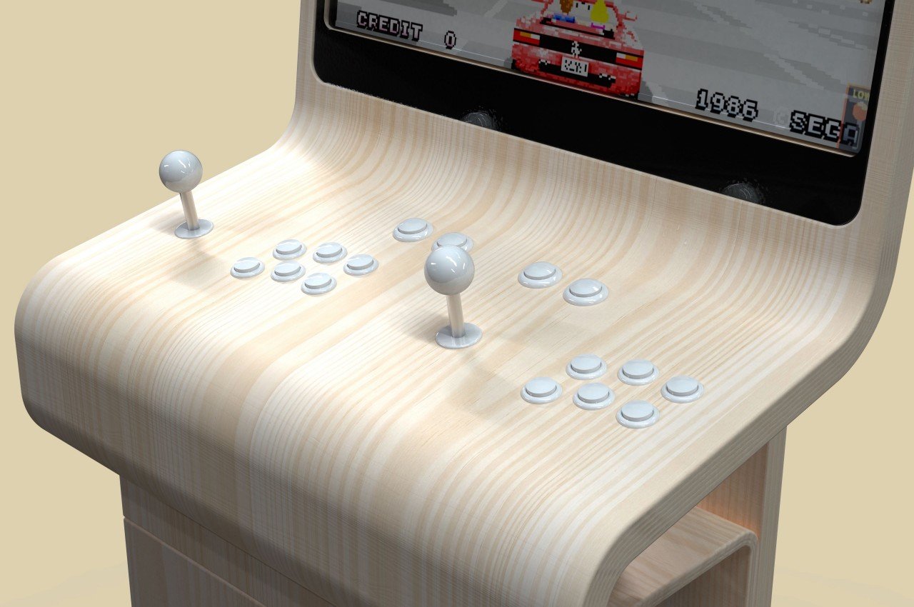
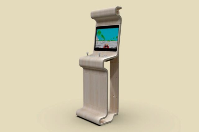
We’ve seen many of these “old school” designs surface in the past few years, thanks to successful “retro mini” revivals of popular consoles from a few decades ago. Of course, not all revivals have to stick to those same old designs, especially when there’s plenty of room to see these old giants in a new light. This arcade cabinet, for example, offers the same functionality as its predecessors but puts it inside a bare, minimalist wooden structure that looks stylish and perfect for a luxurious room.
Why is it noteworthy?
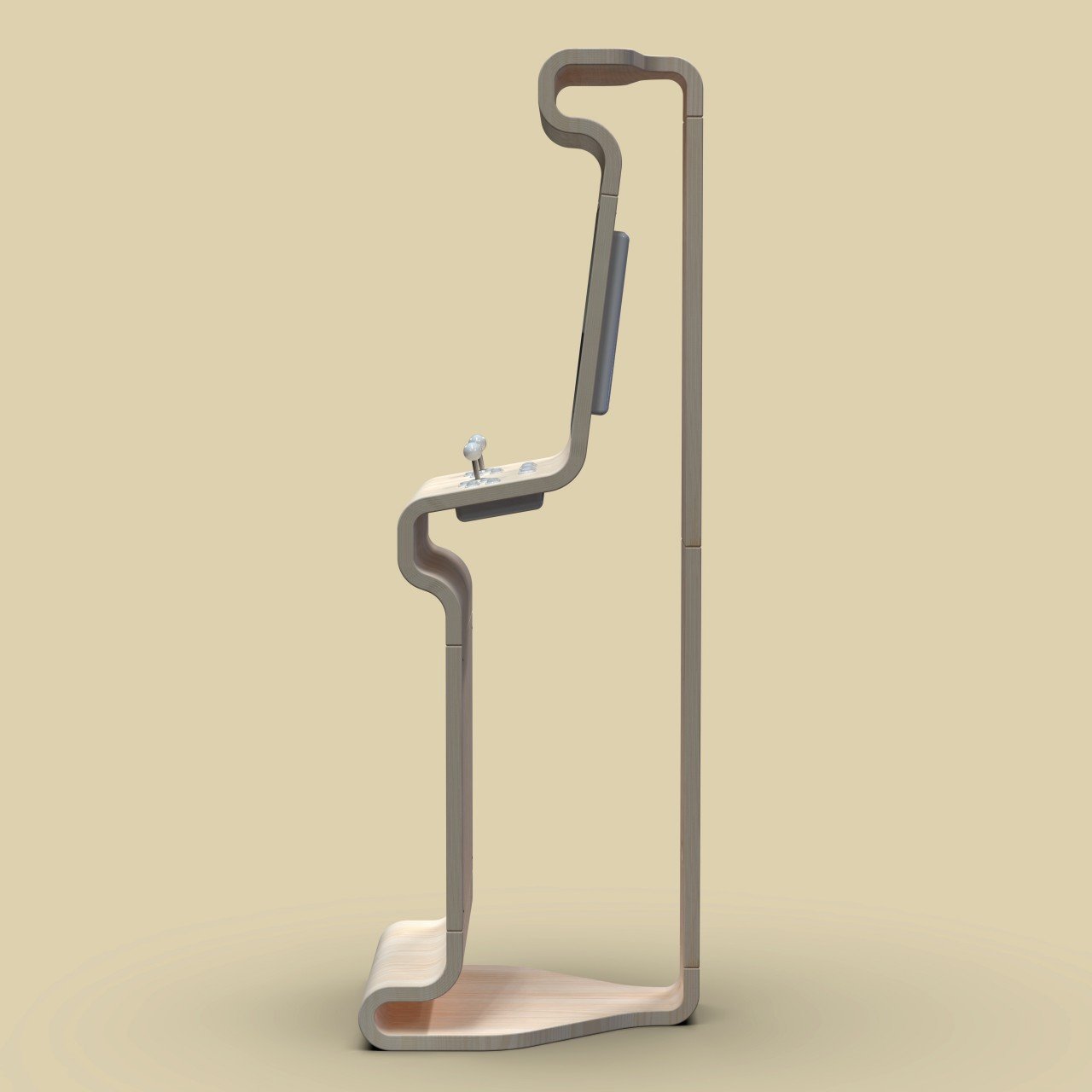
Unlike conventional arcade cabinets, this design can hardly be called a “cabinet” because of its shape. Instead of a large box, this arcade cabinet only has the outer “skin,” showing only the silhouette of the gaming contraption. In fact, it also has its sides left out so that you’ll only see the outline of its profile when seen from the sides. Unlike a typical cabinet as well, this interpretation has its back tapered a bit, streamlining the design and minimizing space.
What we like
- It has plenty of curves that give it a softer personality
- This arcade cabinet almost looks more like an art piece paying homage to the golden age of arcades
What we dislike
- It’s still a concept!
2. The Diag Desk
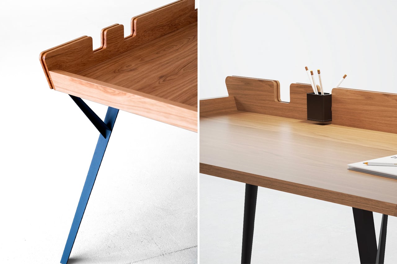
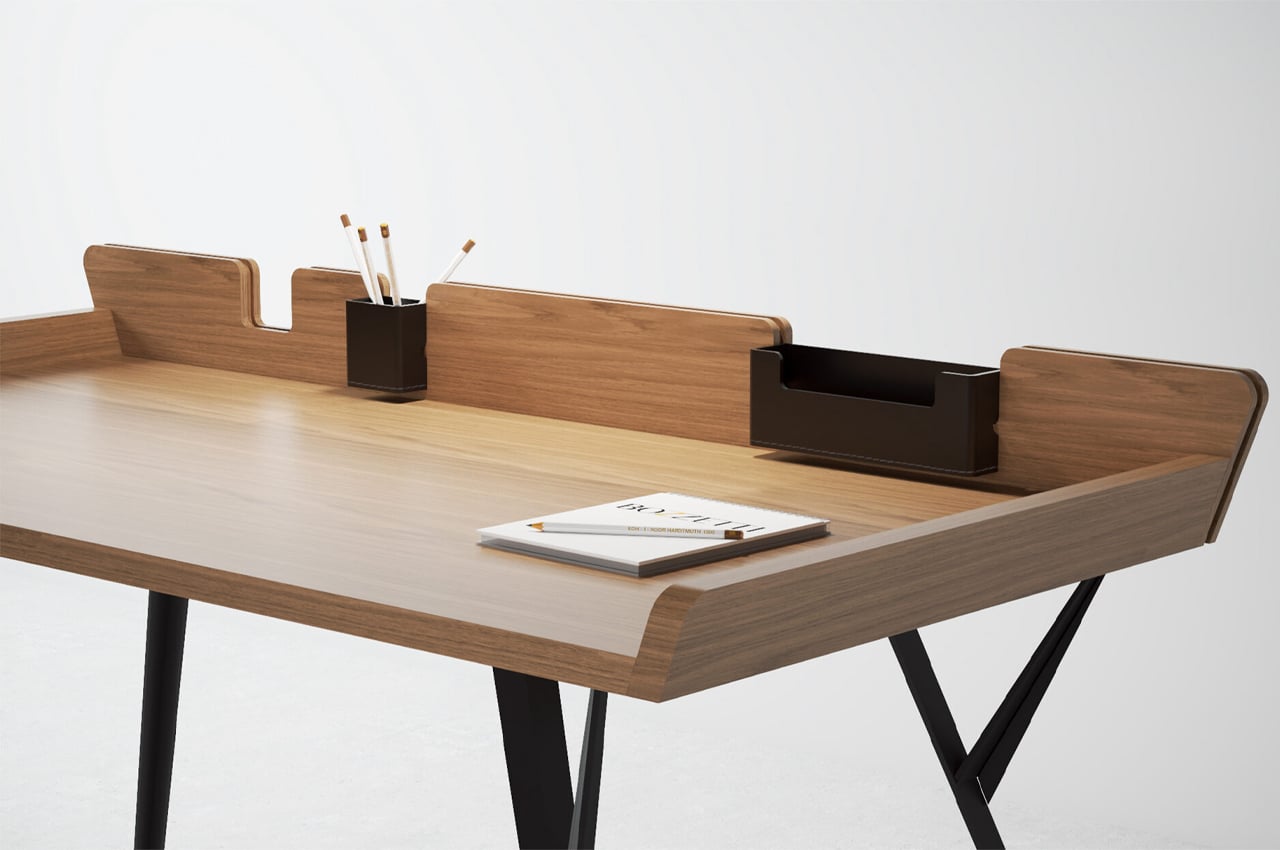
This beautiful, minimal, and modern desk is called the Diag Desk. It’s built to optimize storage space while integrating storage elements such as removable leather compartments. As simple and minimal as the desk is, it doesn’t lack in functionality or practicality in any form.
Why is it noteworthy?
Considering its minimalist build, more space can be devoted to the desk’s tabletop, where most of the desk’s purpose is reserved. The Diag Desk from Polish designer Marek Błażucki is one kind of minimalist design that integrates storage systems into its build, ensuring that users have ample desk space while still keeping their necessary stationery within arm’s reach.
What we like
- Integrates ample storage systems into its build
- Ensures stationery doesn’t fall off
What we dislike
- There are a lot of visually similar desks on the market
3. Onu
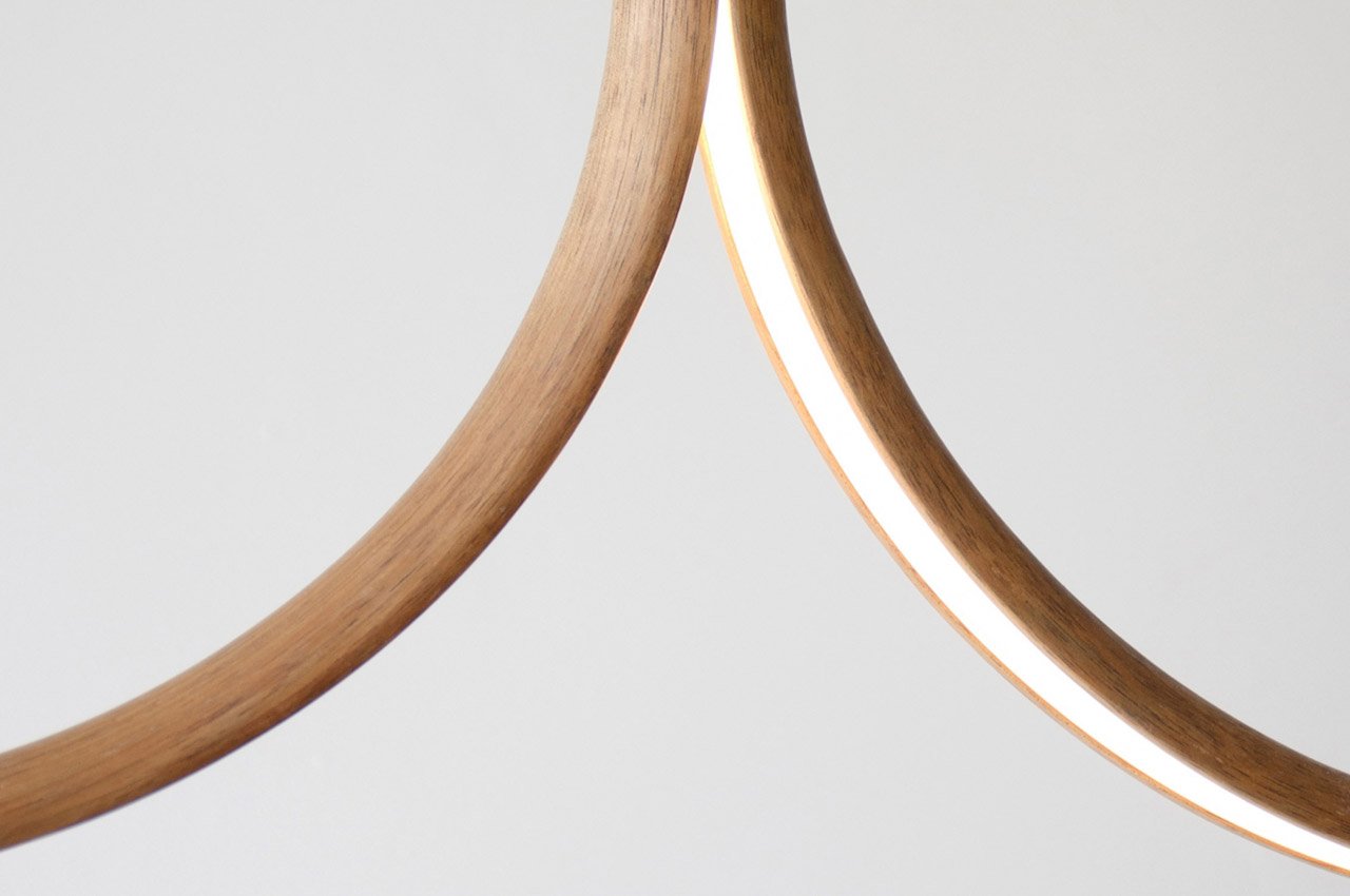
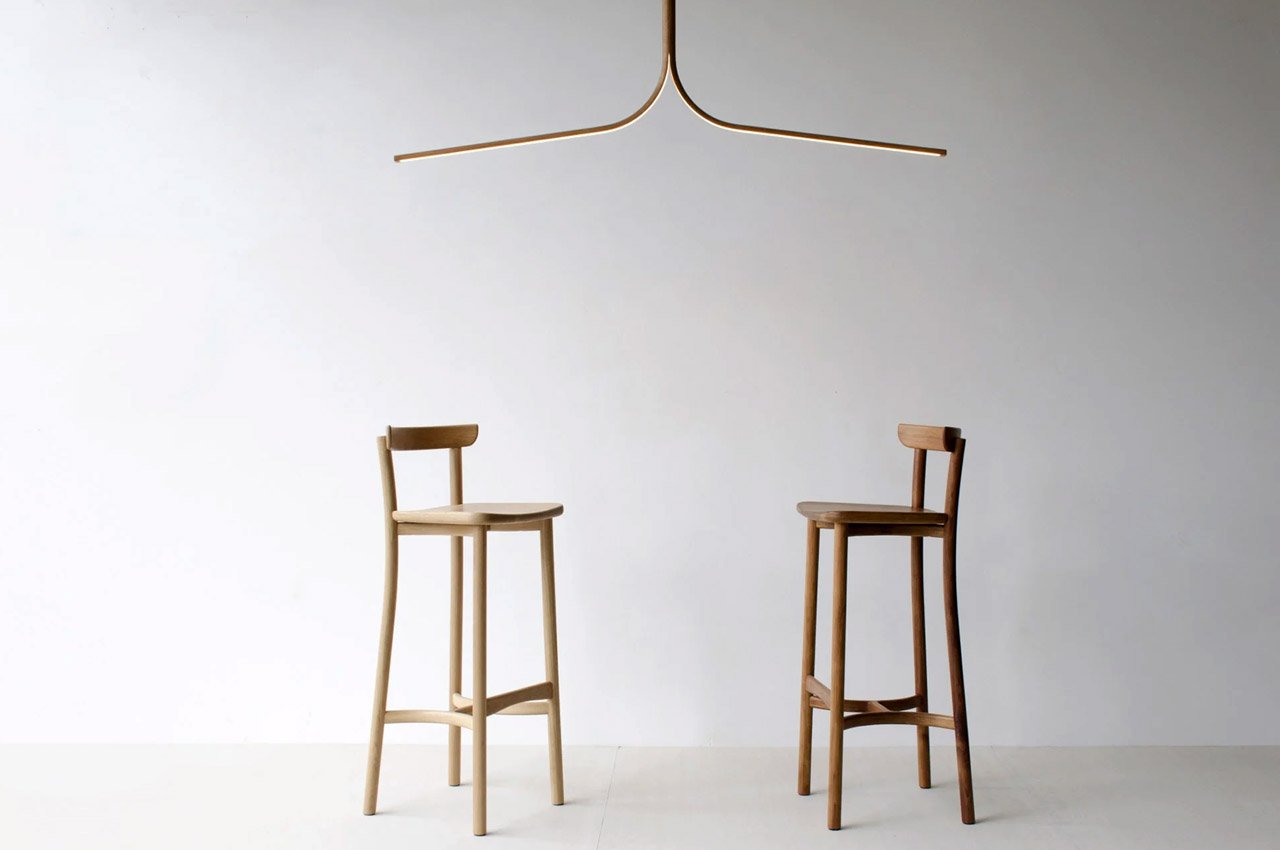
Australi-based Sabu Studio designed a series of lighting designs called ‘Onu’. The Onu series features a pendant, as well as a floor light – beautiful handmade specimens crafted from wood. Both the designs showcase a ‘split’, which in turn functions as the star feature of the products.
Why is it noteworthy?
Sabu Studio merged traditional woodworking techniques with a contemporary approach to design to create the Onu Series. The intriguing split timber section of the designs acts as a light source, one you can definitely not miss. The lights have been crafted from different types of wood – such as oak and walnut.
What we like
- The design is an attempt on Sabu Studio’s part to further incorporate natural elements such as wood, into modern urban spaces
What we dislike
- No complaints!
4. The Spacing Sideboard
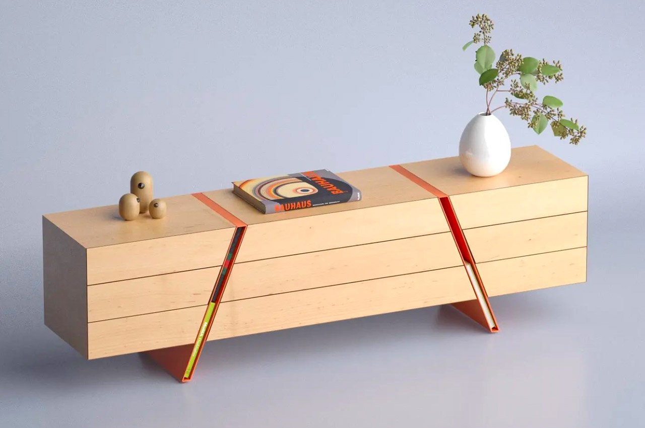
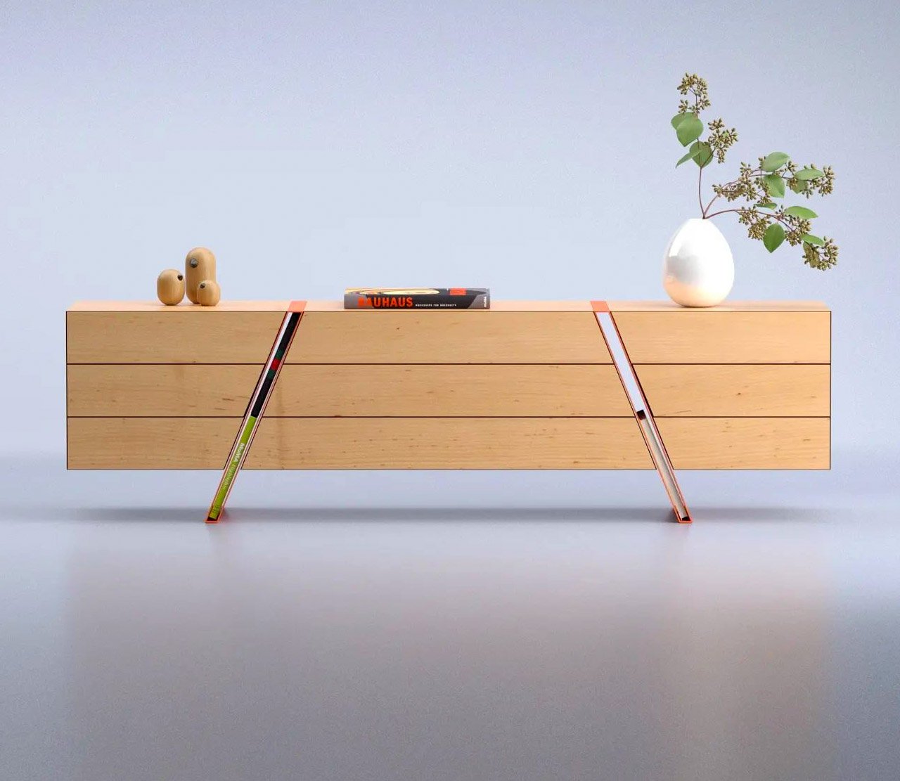
The Spacing Sideboard is a simple wooden piece of furniture that is marked by two bright orange legs. These colorful legs are the star attraction of the sideboard! Because here’s the interesting part, Deniz has integrated the legs into the center of the sideboard, and also carefully left them hollow.
Why is it noteworthy?
The hollowness of the diagonal legs allows them to function as storage spaces! The amount of space is ideal to fit a book or two into it. Yes, you can’t place bigger items, such as say your laptop or even a really fat book in it, but it’s a genius storage solution to display a few of your favorite (normal-sized) books!
What we like
- The sideboard also features push-to-open drawers that emphasize the length of the sideboard
What we dislike
- Not the best storage option for smaller compact homes
5. Serpentin
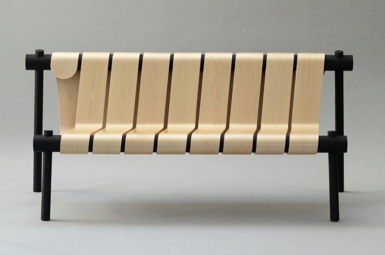
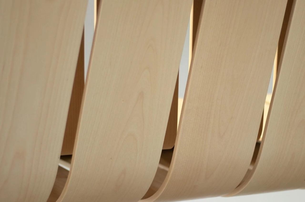
The Swedish-based furniture designer Marc Hoogendijk wanted to create something that blends together technology and design. He created an indoor bench called Serpentin which gives us the illusion that it’s one continuous piece of wood.
Why is it noteworthy?
He says he likes using a methodology that “mimics the function of human-made objects” and then uses this on the furniture he designs. He calls this “technomimicry” and he applied it to this bench as well.
What we like
- Inspired by tubes that are made from a continuous strip of paper wrapped around continuously, like what you see in toilet paper or liquor containers
What we dislike
- The bench may not merge with the aesthetics of different kinds of home
6. The Leaning Chair
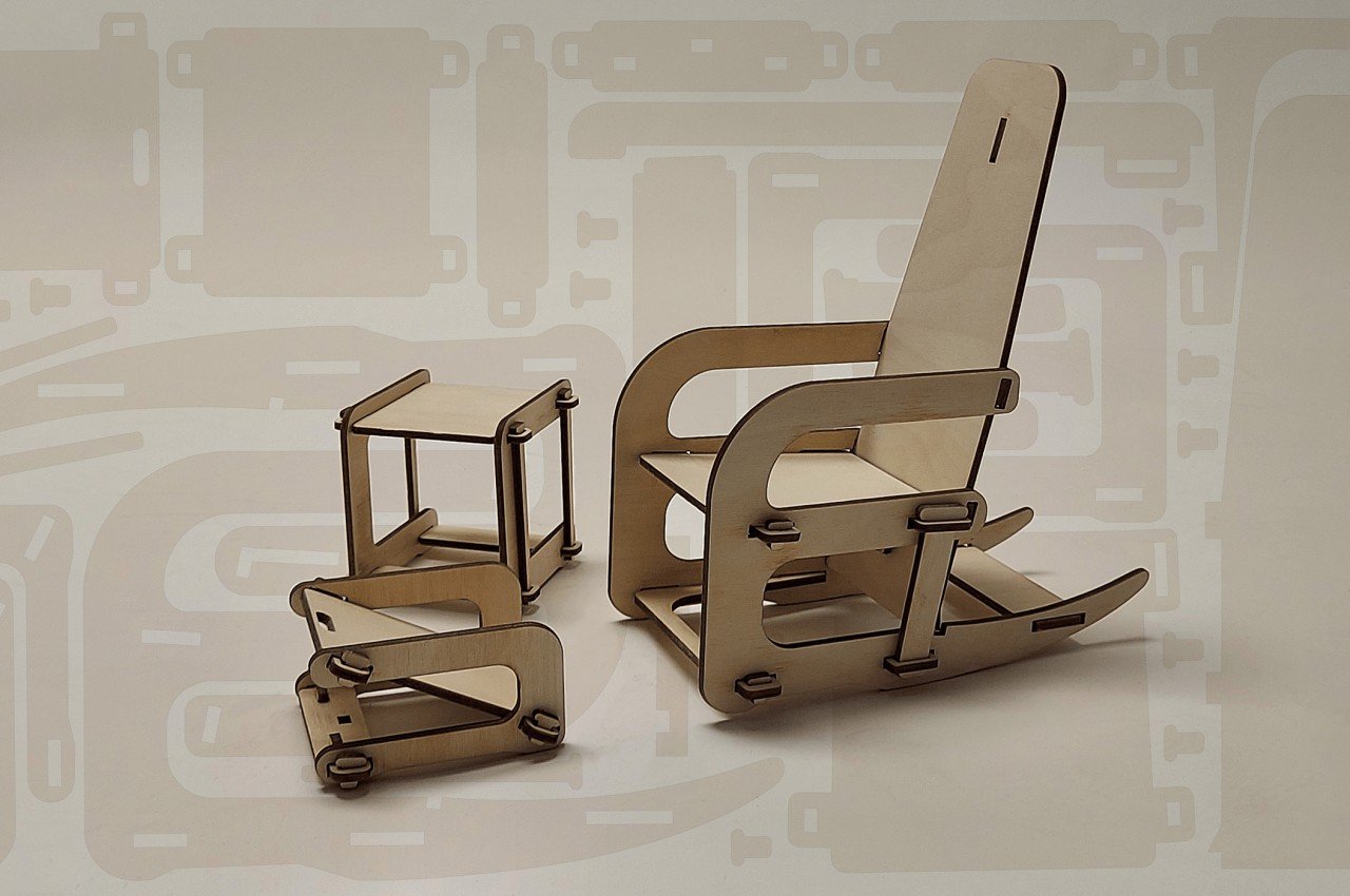
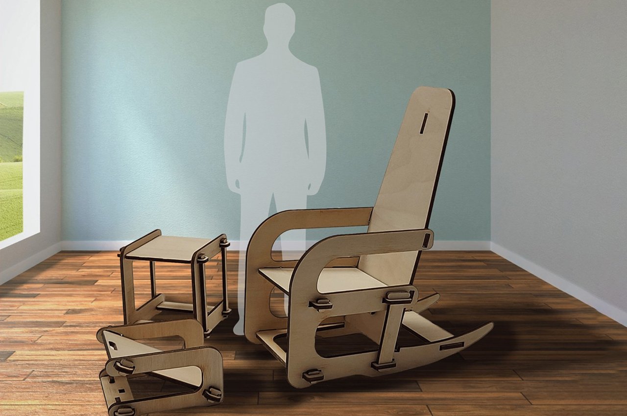
Many flat-pack furniture also come with an implicit benefit. In most cases, the separate pieces can be cut out from a single sheet of material, often wood or fiberboard, which minimizes the wasted material. At first brush, that almost seems like the key feature of the Leaning Chair set, and it’s definitely an important one. All three members of the set are CNC cut from the same 4×8 piece of plywood, and while there are still areas of the sheet that are unused and probably discarded, it’s still a lot less wasteful than conventionally assembled furniture.
Why is it noteworthy?
The set features a chair, an ottoman for your feet, and a side table to complete the setting. Like any flat-pack furniture, they can all be assembled without screws or tools. You don’t even need fasteners or glue to keep them together.
What we like
- Sustainable + efficient design
- Ready-to-assemble
- Sturdier than it looks
What we dislike
- Some people might actually be wary of this kind of assembled furniture, especially chairs that look a bit unstable on their feet
7. The Fly Armchair
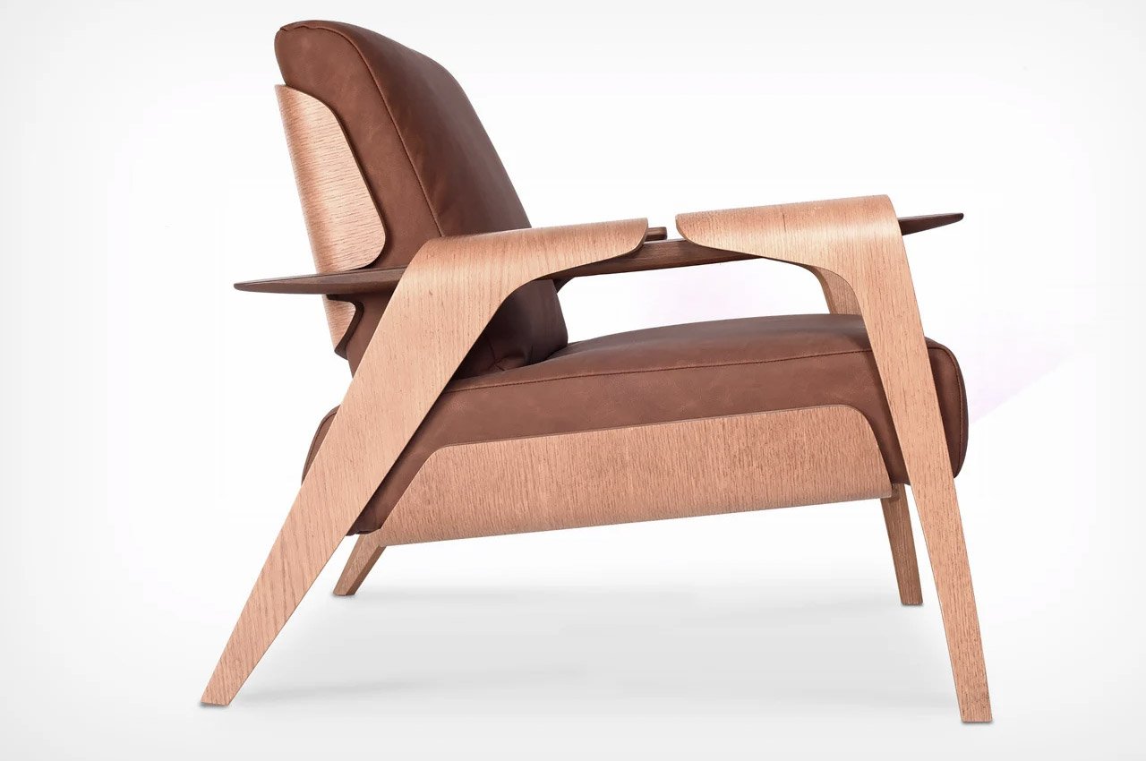
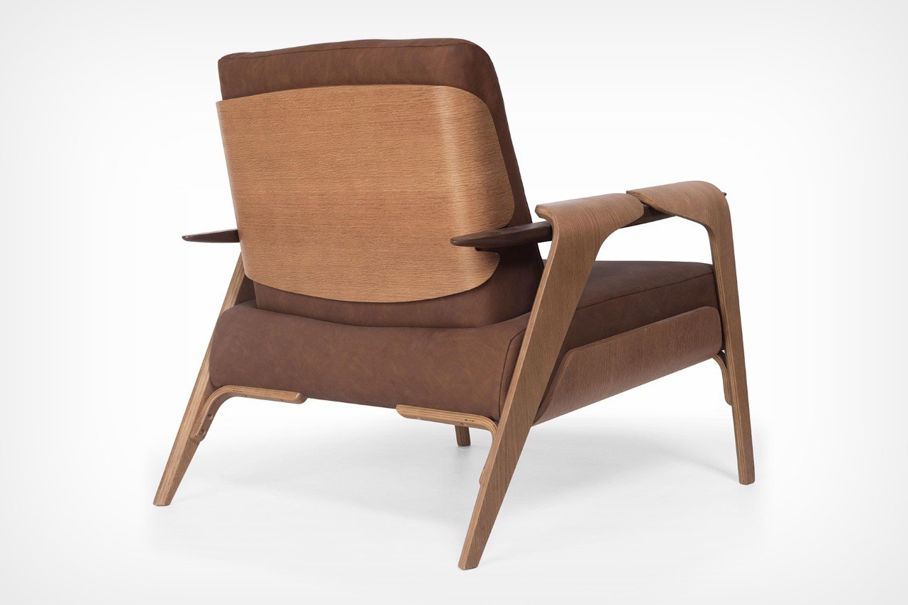
This Golder Winner of the A’ Design Award, is an intriguing armchair created as a result of studies of deconstructivist compositions with the objective of building a product with disconnected elements that paradoxically result in a harmonious object. All its parts are contrasting elements, that somehow come together to create a seamless and minimal furniture piece called the Fly armchair.
Why is it noteworthy?
It’s a common assumption that a chair is a singular frame of wood, lined with cushions at strategic places to make seating comfortable. The Fly Armchair shatters that notion by, instead, opting for multiple disconnected pieces of wood that are magically connected by the cushions and armrests. The wood frame isn’t a singular cohesive unit but is rather a fractured form that’s united by an unlikely hero – the ‘soft’ cushion. To an extent, that too was true with the Eames Lounge Chair’s design, although Lima made a more conscious effort to adopt that style here.
What we like
- Clean + minimal aesthetics
- It’s almost as if the chair’s ‘actual’ frame is wearing a leather cloak, while the armrests, legs, base, and back panel are taking the credit for bringing the chair together
What we dislike
- No complaints!
8. The Pessoa Table
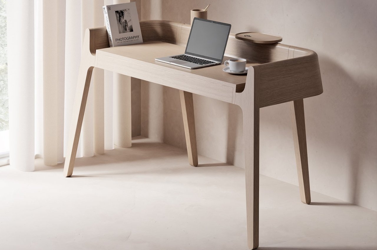
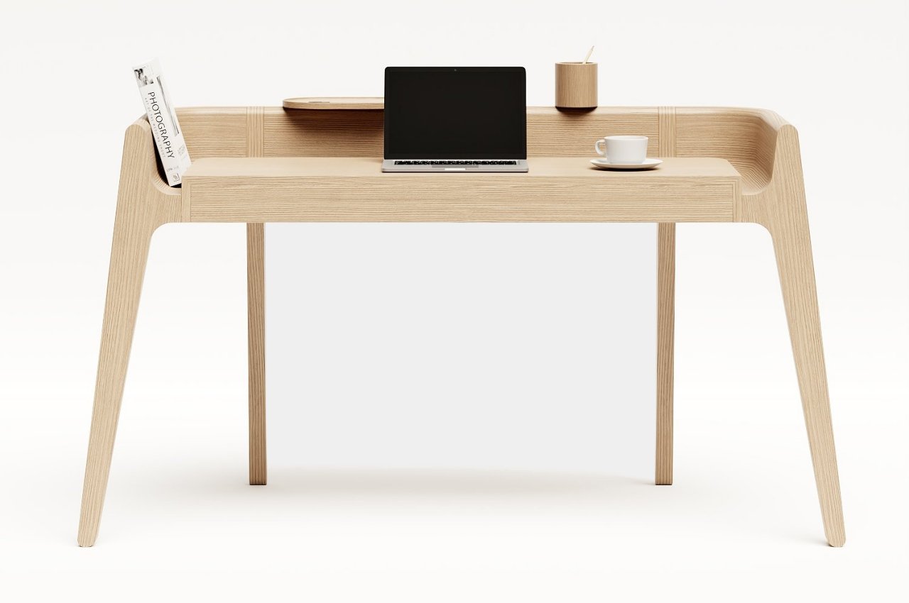
Minimalist desks are great at sneaking organizational features into hidden nooks and crannies, but this striking work table has those compartments and spaces hiding in plain sight.
Why is it noteworthy?
Given the desk’s simple yet beautiful appearance, it might come as a surprise to learn that its form is actually inspired by three very different people with very different personalities. Or, to be more precise, the desk is named after the famed Portuguese writer Fernando Pessoa, whose different “heteronyms” (he doesn’t want to call them pseudonyms) have different and sometimes extremely conflicting ideologies. But almost like a metaphor for that situation, the Pessoa table still retains a unified appearance and beauty, just as all of Pessoa’s seventy-five heteronyms spring from the same man.
What we like
- Minimal + vintage looks
- Features two containers that float in the back panel
What we dislike
- No complaints!
9. The Nodding Chair
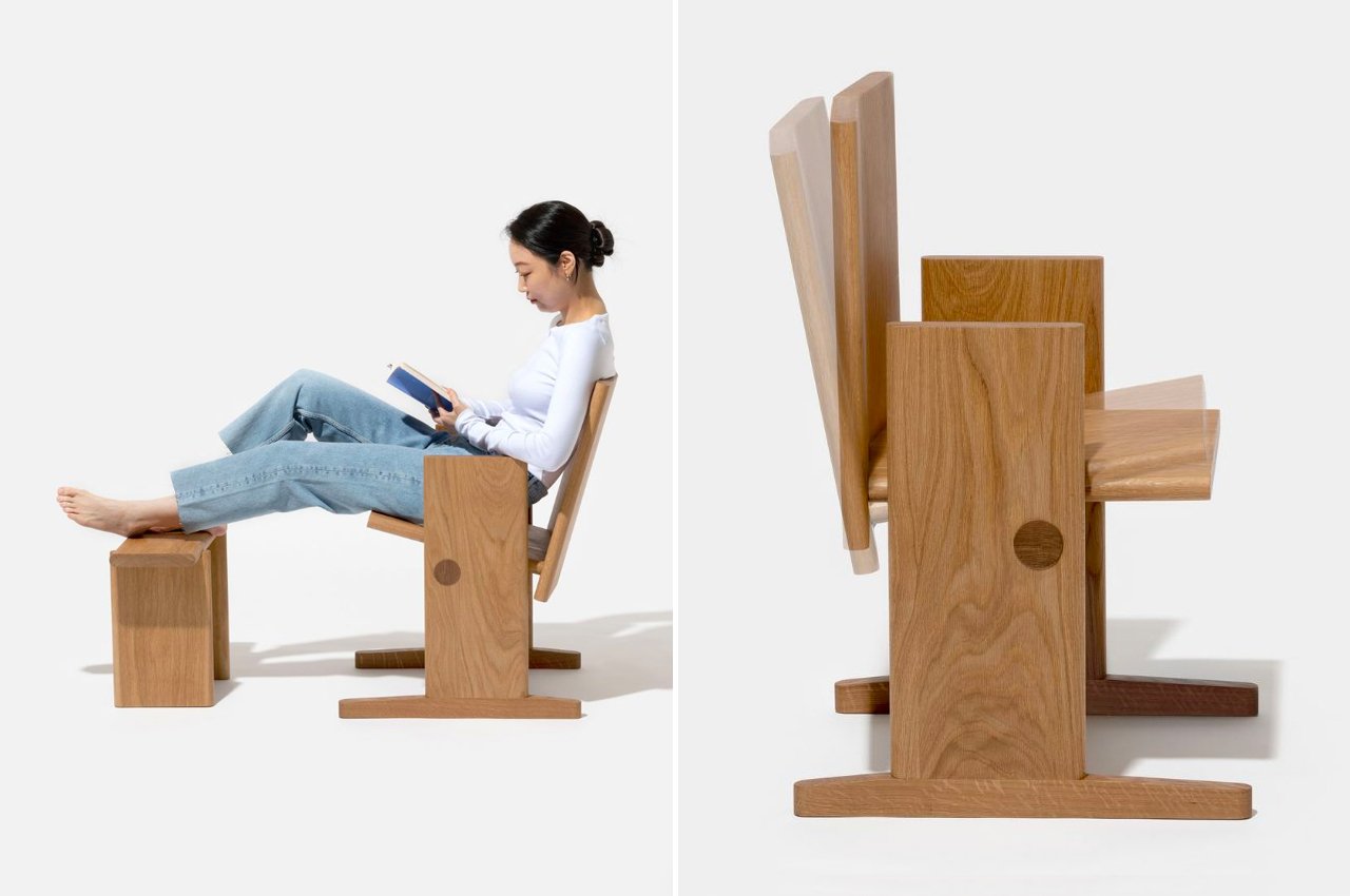
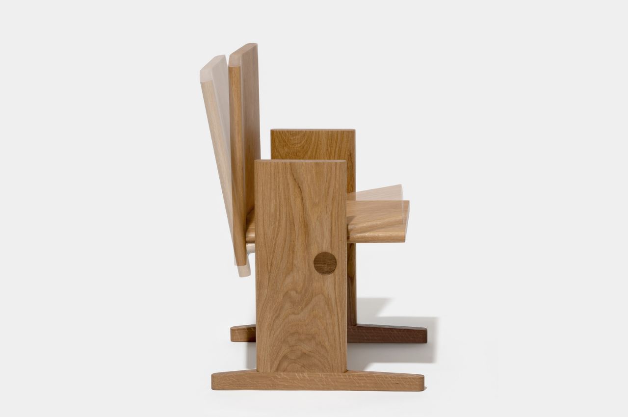
As someone who loves to read, and read for long periods of time, I know that wooden chairs are the least comfortable ones to sit on while finishing a good book. And I’ve also tried to read while on a regular rocking chair and that made me dizzy since the constant big movements are a bit too much for my poor eyes. But staying put in a chair can still be uncomfortable and you need some type of motion while you’re reading. This product concept seems to be the perfect one for bookworms like me.
Why is it noteworthy?
While rocking chairs are good for relaxation, they’re not always good for floors and if you’re like me, for our eyes and peace of mind. The designer thought of a new way to have a chair that can be comfortable and still let your body have its range of natural motion while reading, resting, or even writing (if you’re used to that). The Nodding Chair can be tilted forward and backward, letting you make smaller movements that won’t make you too nauseous.
What we like
- Creates less pressure on the floor so you won’t get marks and scratches
- Allows the chair to move with you as you occasionally change positions while reading
What we dislike
- The seat itself doesn’t seem to be that comfortable as it’s just plain wood and there’s no cushion
10. The Bogdan Collection
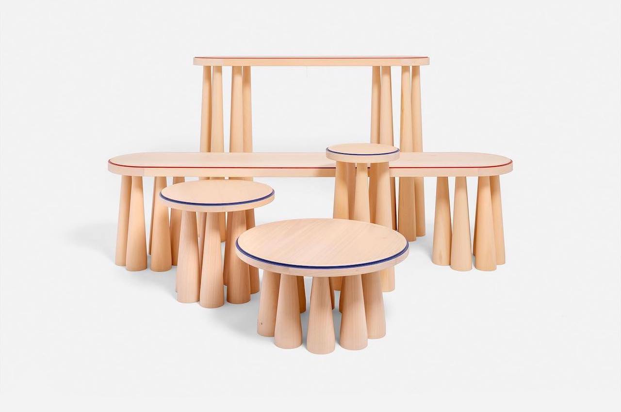
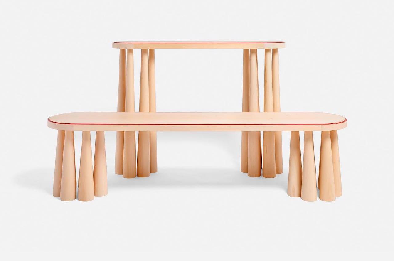
There is something about Italian furniture that sets it apart from others. We love that furniture design can be elegant, luxurious, and modern at the same time. That is for most of the contemporary pieces we are being introduced to, like the Bogdan Collection by Studiointervallo.
Why is it noteworthy?
The studio’s founder, Andrea Ghisoni, designed this series of furniture that includes a bench, a console table, a coffee table, and a side table. You may want the whole collection as every piece can go well with the minimalist aesthetics of your home. Every unit is made of a single carved solid linden wood and boasts a single line of color defining the shape and the perimeter.
What we like
- Features colored milled-edge ribs for a bit of style and accent
What we dislike
- No complaints!
The post Top 10 wooden furniture designs for lovers of this warm + minimal material first appeared on Yanko Design.

