This year marks twenty years of me wearing spectacles. They started as chunky, colorful Acetate frames and made their way to sleek Metallic frames, with one brief period in between where I tried contact lenses. This story is about that time. I remember dressing up to go to prom, deciding I’d show up without those geeky spectacles. I was facing the mirror, contact lens on my finger, ready to put it on. It was a warm summer day and the fan was on in the room. The lens, balancing precariously on my finger, managed to catch the breeze and flew off my fingertip, landing flat on the mirror. I went to peel the lens off… and only half the lens peeled off. I was left holding a semi-circular piece of rather expensive hydrogel, while the other semi-circle stay put on the mirror. Cut to the prom, where I sat in a corner drinking fruit juice and wearing clunky frames.
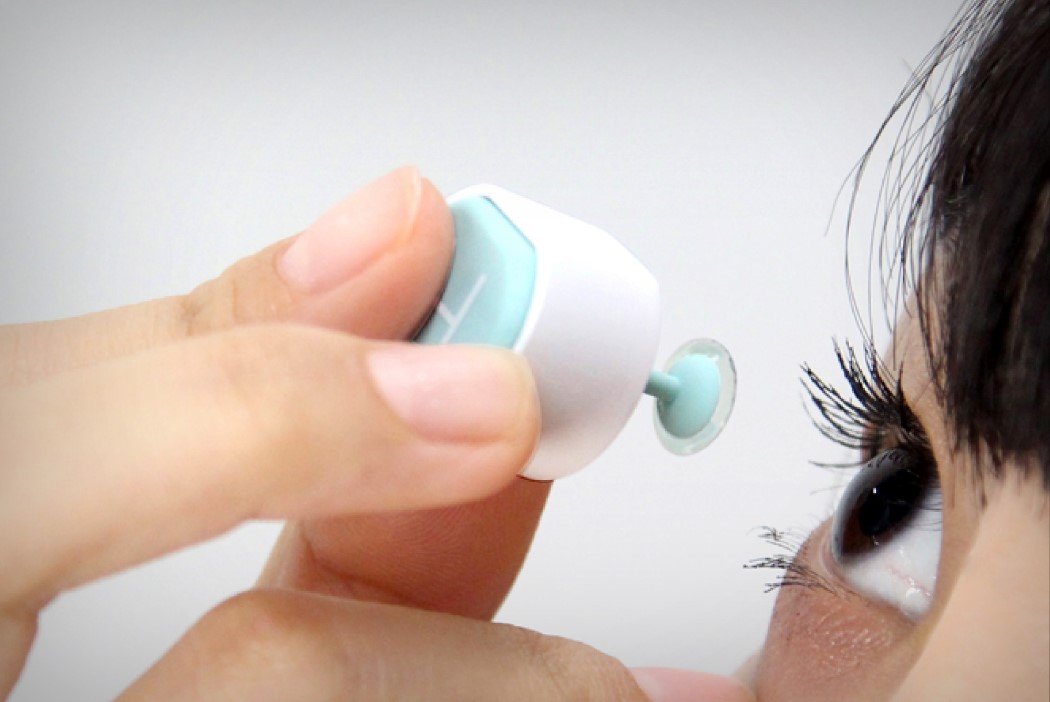
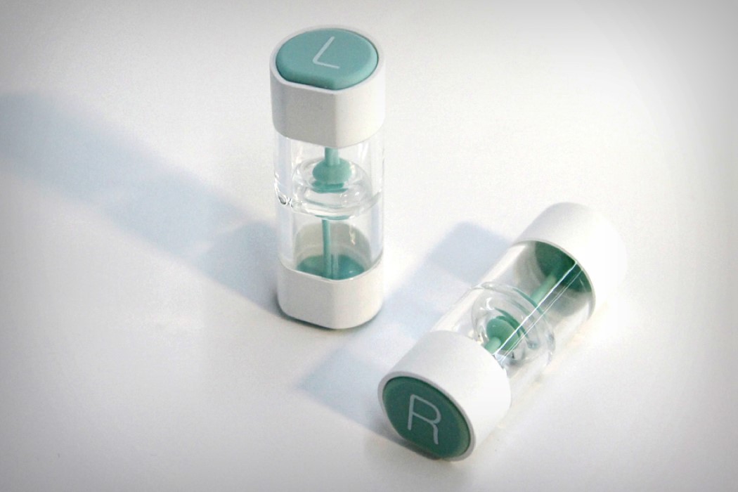
Wow, I feel like I’ve shared a lot with you, so I might as well just get to the point here. The Push Lens Case, if it existed in 2007, would have altered my life. Designed as a case/holder, and even an applicator, the Push Lens Case allows you to store your lenses efficiently, without mixing up the left and the right. It also lets you apply your lenses without the aforementioned (albeit rare) woes. The case also adopts a clever truncated cylindrical design that prevents it from rolling off surfaces like tabletops! Yes, I’m impressed, but after a 20-year relationship with my spectacles, I think I’ll stick to the glasses.
The Push Lens Case is a Winner of the K-Design Award for the year 2017.
Designers: Soo Jung Youn & Jihye Lee.


![]()


