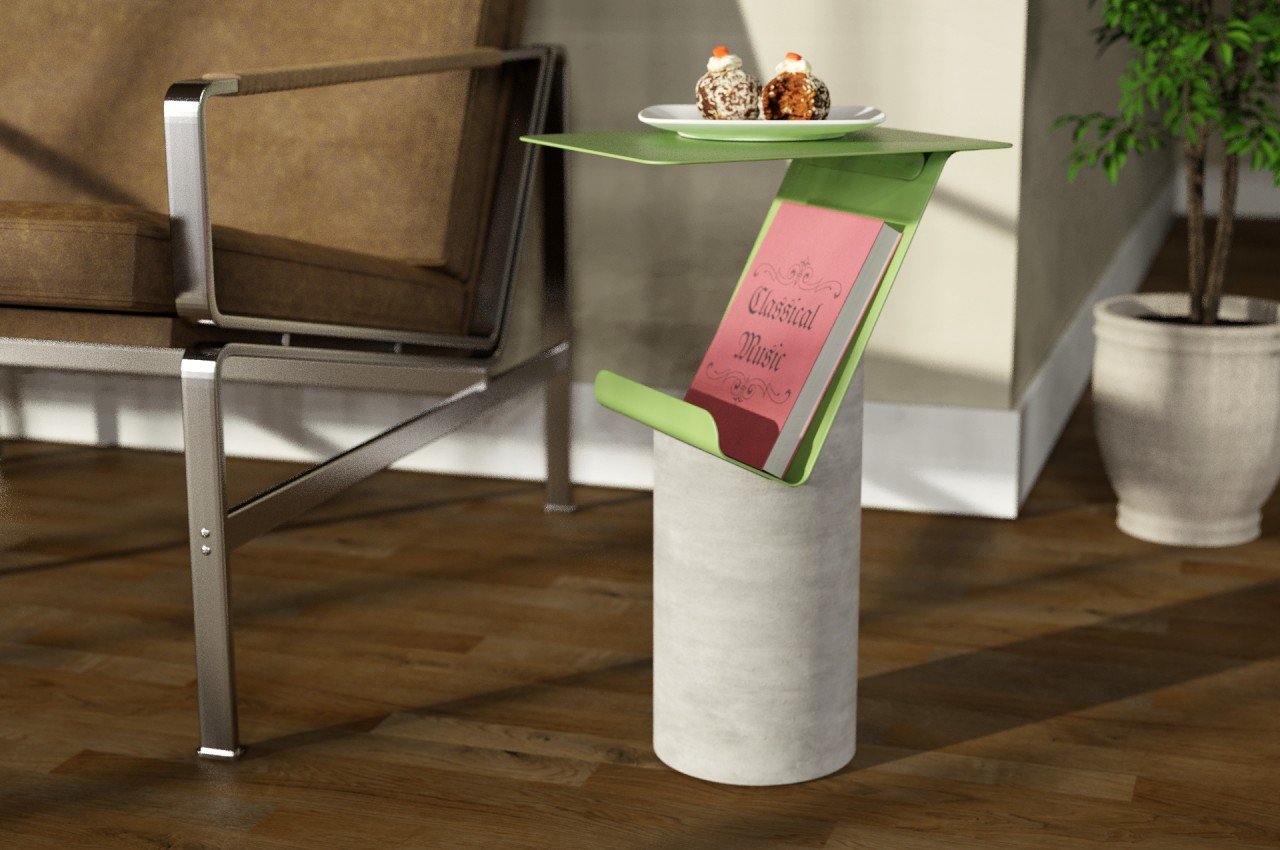
Most of us have reading materials lying around the house, sometimes in multiple places. There might be books we’ve been trying to finish for months, magazines we’re collecting, or some special coffee table piece that shows off our particular interests. Those with more active reading habits will want some of these to be within reach or displayed within sight, but most shelves and coffee tables serve only one or the other. This side table, however, is able to do both, and it puts your reading materials on a pedestal designed to be both utilitarian yet also appealing in a certain brutalist fashion.
Designer: Hyeonil Jeong

We all have particular tastes in furniture, but most would probably prefer one that looks finished and complete rather than raw. At least for indoor furniture, the go-to materials included finished wood, sandblasted metal, matte plastic, and cut glass, to name a few. Some outdoor furniture tends to look a bit rougher, hinting at their ruggedness and durability. Of course, there’s no hard rule that says these designs can’t mix, like a combination of concrete and metal that makes a powerful statement inside the living room.
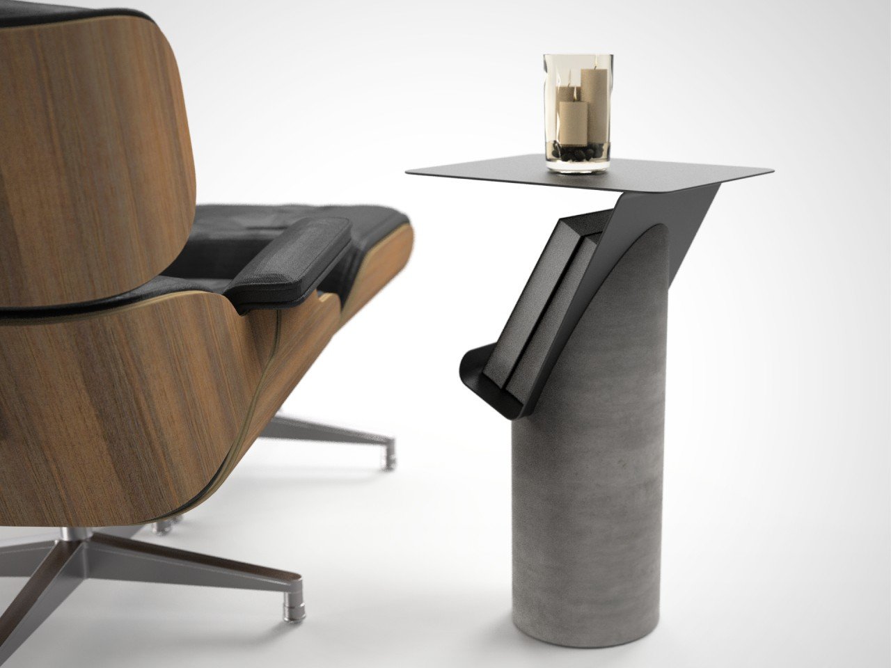
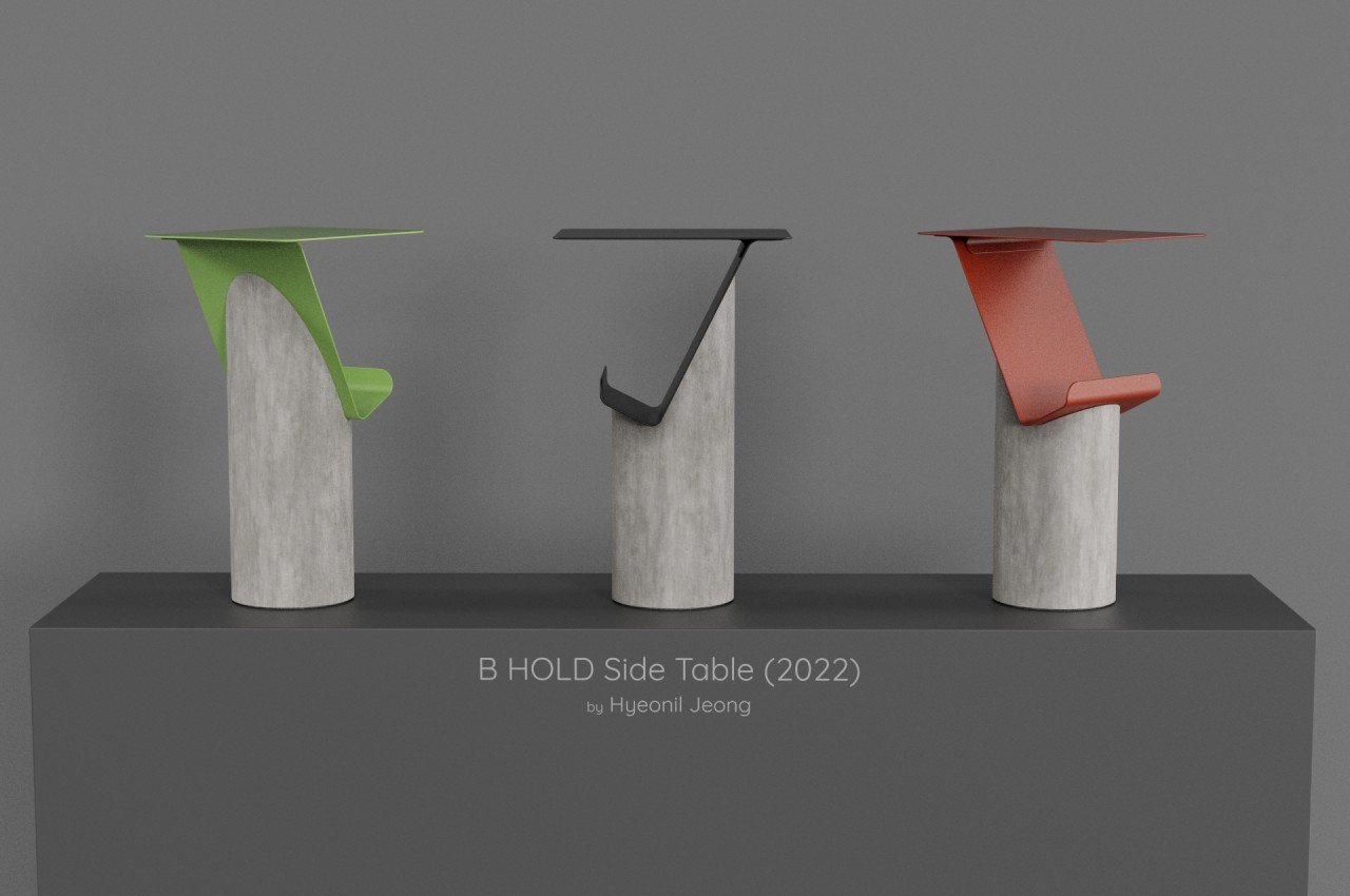
The B HOLD side table concept is one such design that is minimalist to the point of almost being raw. The base is a simple concrete cylinder with part of its top hewn to make room for the tabletop. That “top” is made from two pieces of metal joined at an angle, with one forming the flat horizontal surface on which you can confidently place your coffee mug or wine glass.


What makes this design different is the space beneath that tabletop. Inspired by both magazine racks and book stands, it lies at an angle that makes it possible to stack a few books or magazines without any of them falling off. That angle also makes it easy to see those reading materials, particularly the one sitting at the top of the stack. It presents an opportunity to show off what you’re currently reading or a book you want to boast about.
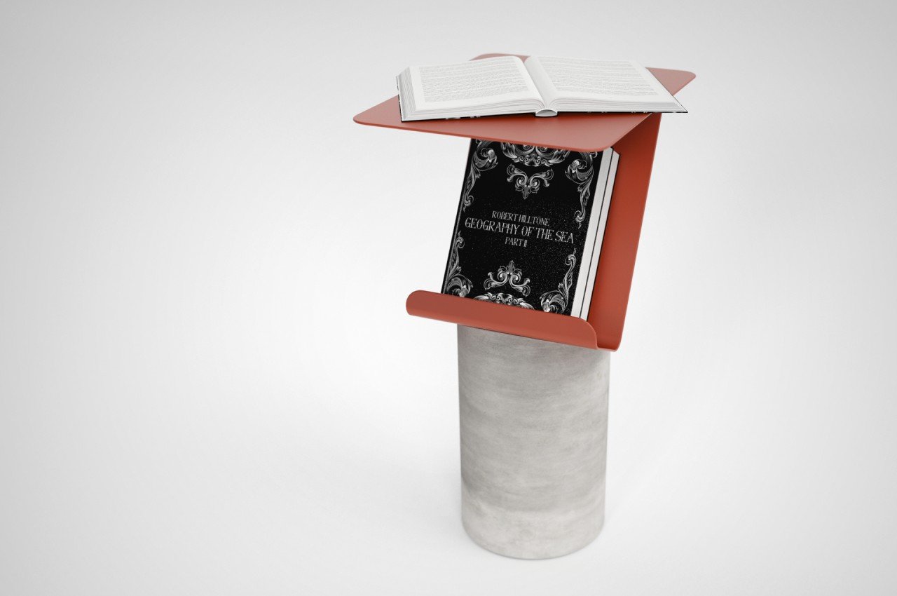
That space won’t be able to fit a whole collection of books, so you’ll have to pick only the best or current volumes. In a way, that limitation does force you to be a bit organized and more discerning, at least with what you want to put on display. The side table design is simple yet effective, raw yet powerful, creating a dedicated space for you to take a breather, sip a cup of coffee or tea, and pull out something to read, all while giving guests a peek at the books that make you, you.

The post This brutalist side table enthrones your books and magazines for everyone to see first appeared on Yanko Design.


