
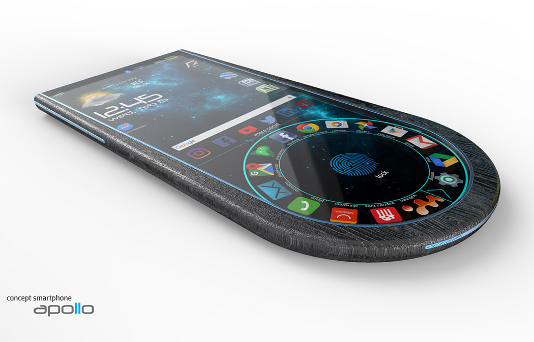
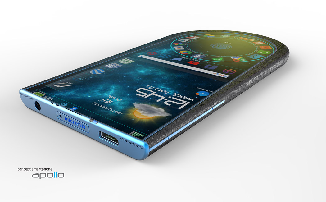
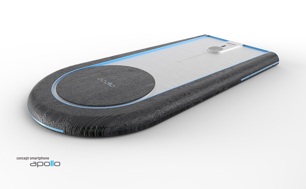
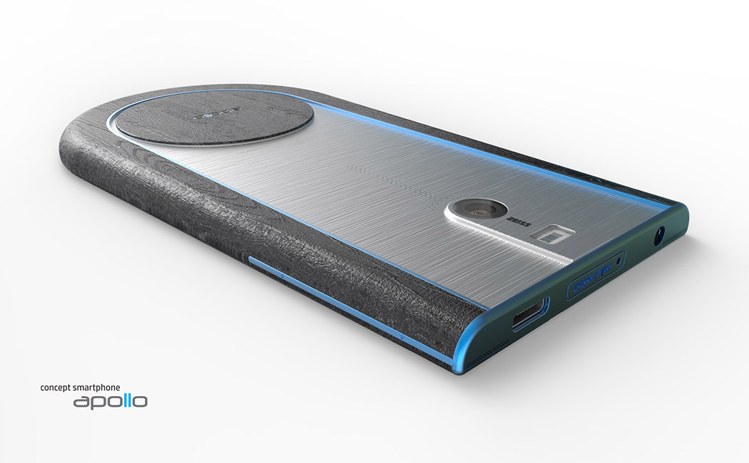
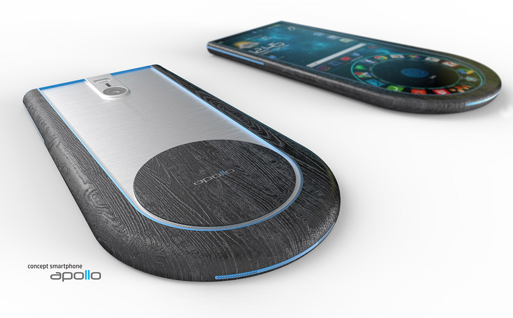
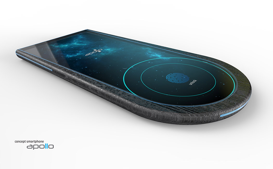
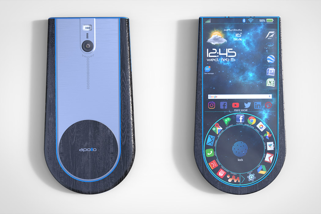
From the designer of termite-enticing APOLLO 1 smartphone comes the 2.0 and it’s every bit as woody as the first! Like the original, it marries natural materials with modern tech, only this time it looks to be twice as thin. Instead of a dark ash, APOLLO version 2.0 is clad in a super-sleek black ebony that contrasts nicely with Tron-style aqua details. Its body sports the same circular bottom half that makes it rest comfortably in the palms and allows for the rotary menu to quickly navigate apps and settings. The blue’s a nice touch, but I’m kinda missing the silver detail of the original. Which do you like better?!
Designer: Varnicic BranislavVarnicic Branislav
![]()


