Mobile phones, and this is irrefutable, have always been about screens. Ever since the first hand-held phone sported a screen, it became singlehandedly the most integral part of the phone. Adding the camera to the mobile phone just catalyzed the screen race… and well, honestly, the race is close to its end… and with it, the golden age of smartphones.
BEZEL = PUBLIC ENEMY NO.1
It’s important, however, to understand how we began hating the bezel. I don’t know who started this movement, but I assume it began somewhere in the corners of Behance when some half-baked designer made a “Concept iPhone” which was literally all screen (I’ve been seeing this since 2012). The movement saw its first milestone when Samsung (pretty much the manufacturer of every smartphone screen) launched their Edge range of phones that curved the screen to the side in a way that opened up new doors for mobile interaction. This got everyone thinking of how this flexible display technology could create a phone that was “all screen”. When mobile phone makers were convinced that their screens were hi-res enough, with pixels barely being visible to the human eye, the Kill-bezel movement truly gained speed. The first to go were the bezels on the side. The upper and lower ones remained for the cameras, sensors, earpieces, and the home-button… until Philippe Starck threw them under the bus with the Xiaomi Mi Mix, followed by Tim Cook exactly a year later, who stepped onto the stage at the Steve Jobs Theater, unveiling before the world, the iPhone X. A phone that was poised to become the benchmark of what new phones should look like.
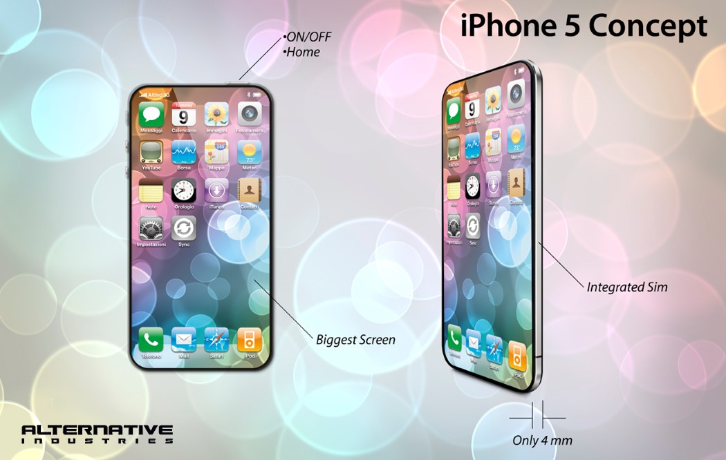
An “all-screen” iPhone concept that made it to CNET’s website in 2012.
THE NOTCH HOTCHPOTCH – ACT 1
MKBHD makes some pretty astute points in his “The State of Bezels” video. The gist of it is that everyone wants to get to the promised land of a 100% screen to body ratio on the phone’s front. Everyone’s had different ways of overcoming the same obstacles.
There are a couple of components that the front of every phone usually has by default. The display, earpiece, proximity sensor, light sensor (controls screen brightness depending on external light), the front-facing camera, and lastly, in the case of a few phones, the home button/fingerprint sensor. The proximity and light sensors are incredibly small components and usually hide somewhere on the top. The earpiece is a tricky bit, and most phones have made them incredibly streamlined, fitting them in the gap between the glass and the phone. Android’s had the luxury of having killed the home button a long time ago, which made pushing the fingertip sensor onto the back a rather easy decision… but TouchID and that iconic circle below your screen have always been a part of Apple’s image. Pushing that to the back of the phone would present a pretty unique design challenge of visually balancing out Apple’s logo on the back with the TouchID button. Since turning the logo itself into a fingerprint sensor was out of the question (the apple’s non-circular shape wouldn’t read your entire fingerprint, and it would be incredibly tacky), Apple’s design team ditched the button completely for their latest offering, the FaceID… and with it came the infamous notch.
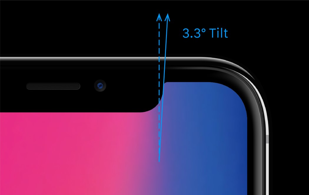
Read our article on the iPhone’s strangely satisfying geometry.
THE NOTCH HOTCHPOTCH – ACT 2
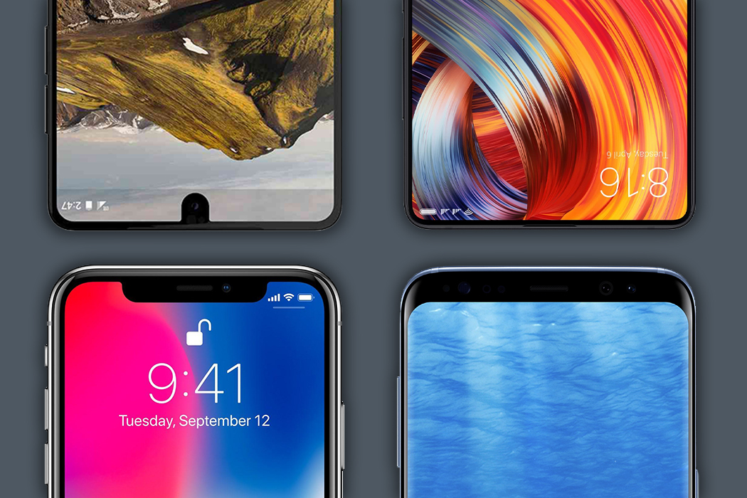
The notch, as much as I detest it, is quite remarkable. Not only does it house a rather incredible, impregnable facial tracking system, it’s proven something else. Apple has a bunch of loyal followers… not in the people who buy the phone, but in companies that look to Apple to set trends. Here’s a look at the new wave of phones that were showcased at the Mobile World Congress in Barcelona this year.
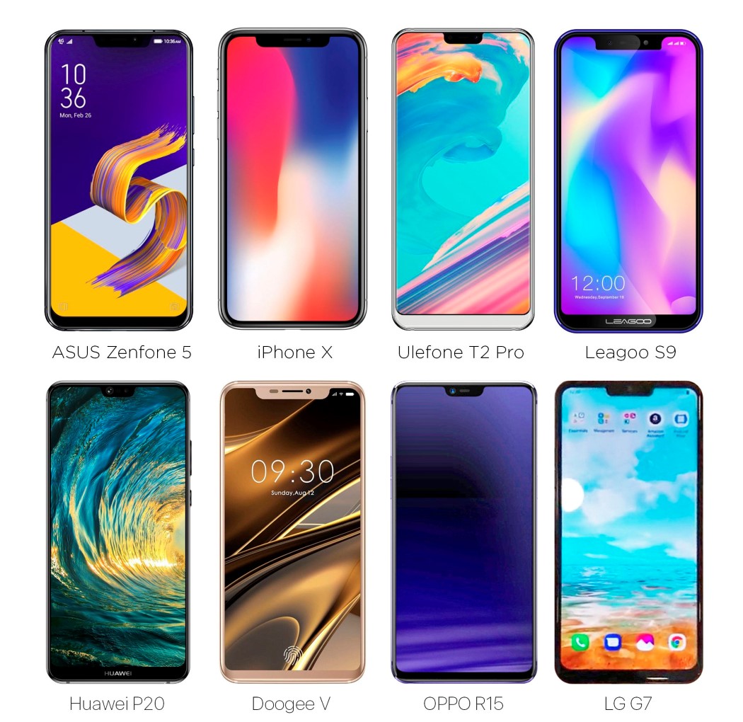
Look at the image above and you’ll realize we’re very soon moving to a future (or we’re stuck in a present) where phones are going to start looking eerily similar. Ten years ago, phones had bezels big enough to even sport the company’s branding, but now all they can afford the space for, is a front-facing camera, and probably an earpiece. MKBHD states that the notch itself is an intermediary phase, while manufacturers and designers figure how to attain the full-screen look. Each company treats it differently, with Samsung ditching the notch for a slick bracket shaped design, and the Essential phone having that little tongue, or like the Xiaomi Mi Mix that actually puts the camera on a bezel at the bottom, leaving the top completely bezel-less. My point is that no matter how marginally different phones look today, each and every brand is looking at the exact same future. One where all you see on the front is a display… But we’ve still got to do something about that front-facing camera.
SO… THAT FRONT FACING CAMERA NOW
I’d like to think that nothing truly is impossible with phone design. Apple tried long and hard to integrate the TouchID into their displays, letting your screen read the fingerprint, but they failed to do so, hence the FaceID (which numbers indicate turned out to be a resounding success). Later in the year, Chinese manufacturer VIVO showed that having an in-screen display was possible with the X20 Plus UD, which debuted at CES 2018 (a CMOS sensor sits under the display, virtually invisible when your screen is on)… and at the Mobile World Congress, showcased a prototype of a concept they were working on, the Apex, the first phone to have nothing except screen on the front. It used VIVO’s in-screen fingerprint technology, and the front-facing camera sat on a component that slid out the top of the screen (a lot like the in-built flash on a DSLR), and back in when you closed the camera app.
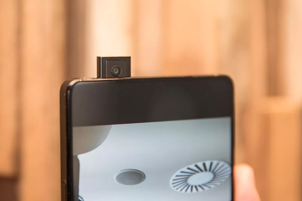
Now, this isn’t really the definition of practical. Yes, it means your camera isn’t snooping on you, but any tech person will tell you, moving parts are a BAD idea. They’re the first to fail with excessive usage. Look at laptops for instance. The first thing to break is almost always the hinge. The Apex concept however does boast of the highest screen to body ratio ever, and Spanish company Doogee has a similar concept phone in the pipeline.
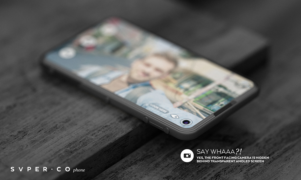
Interestingly enough, the SVPER phone concept popped up on our radar in 2015, and the designer does what I can only describe as the best way to integrate+hide the camera.
The SVPER concept phone hides a front facing camera under a transparent AMOLED. When you want to click pictures, the part of the display directly above the camera switches off to reveal the lens. The camera, therefore, stays hidden from view in normal use, creating a stellar full-screen, no bezel experience. This is in a lot of ways much like what VIVO does with its in-screen fingerprint reader, so a future where the SVPER phone exists isn’t far off. Now let’s examine why this is such death-knoll for your smartphone.
SMARTPHONE? OR SMARTCLONE?
Let’s time-travel to the future. It’s 2019 and the all-screen phones are finally here. They feel great and everyone has one… but then it’s the end of 2019 and a new phone releases, but wait. It looks exactly the same as the one you already have. All that Jonathan Ive can say in the iPhone launch video is that the “new iPhone is the best we’ve built… because it’s now thinner.”
A world where all phones have only a screen on the front would be like a world where all cars look exactly the same but just feel different on the inside. Brands would struggle to make their phones stand out, and customers would be truly baffled because all phones look the same. It begins a desperate feature war. The phone with longer battery life, the phone that bends, the phone that reintroduces the headphone jack (a transparent phone is never going to happen so forget about it). Everything now is a gimmick because we’ve successfully homogenized the phone, so visually, there’s no reason two phones say within the same Android ecosystem would look any different. And THAT’s a BIG problem. We’ve tried the megapixel competition. The Nokia Lumia 1020 had a 41-megapixel camera and it absolutely tanked, but in the same year, Apple launched the Retina screen and it was a runaway hit. Screens have grown as big as they can and as clear and vivid as they can, so killing the bezel is the logical last step. And since phones now look the same with just minor feature variations, phone sales will take a dip as designers scratch their heads and go, “now what?”. Oh! Icing on the cake… your all-screen phone is going to have a disappointingly bad battery life because displays are notorious battery guzzlers.
SO… WHAT’S NEXT?
Experts have long predicted the downfall of the smartphone, with wearables being the future. As ominous as it may sound, your health and medical data are of immense value (to you as well as the medical industry), which wearables are poised to gather, aside from the data you contribute through your smartphone use and your browsing habits. There have been instances where these wearables have saved and improved the quality of lives (if you remember the heartwarming Apple Watch video from the September 2017 keynote), but it’s truly a fine line. Choosing to surrender your data for a better and hopefully longer life is a massive decision that everyone will have to take in the long run, and with the current state of affairs, I can only hope that data will be much more secure than others. Not that I mean to trash wearables, but the future is definitely in being able to provide an IoT experience that can help you live not just a more connected life, but rather a better and healthier life.
Before that really kicks off, there’s enough reason to believe 2018 and 19 will be a glory era for visual interface and experience designers. The immediate homogenization of the smartphone will spark what I can only describe as a race to be different. If you’re a UI UX designer, bolster up because the mobile industry may just absolutely explode in a year or two. Stock OS for mobiles is sure to become less appealing to phone manufacturers who will want a ‘personal touch’ on their phone’s interface because physically each phone looks the same.
I can’t really remember where I heard this, but the bezel isn’t the only thing that’s been dying. Silently, yet surely, companies have been killing off the keyboard too. Realizing that your voice is the best and most natural way to interact with your machines, the rise of Voice-powered AI has helped create a more human-like tech experience, as we move to a very Spike Jonze-ish future where we don’t type things out or touch icons on screens, but simply run services and programs by talking to our AI. Maybe the smartphone won’t suddenly lose purpose once it becomes the bezel-less device we’re seeing it turn into. Humans love looking at screens, but humans love companionship more, which is probably the only way to keep smartphones alive in the long term. The smartphone may just seamlessly transition from a piece of tech in your pocket to a digital assistant or friend that you talk and listen to in the long run. It’ll be interesting to see the transition from this visual-heavy experience to something that’s multi-sensory and feels more ‘real’ (and also to see how many brands make it this far as well as how they compete with one and another)… as for that phone? It won’t be a smartphone anymore. It’ll be so much more… but until then *points iPhone notch at my face* “Let me take a selfie”.
![]()

