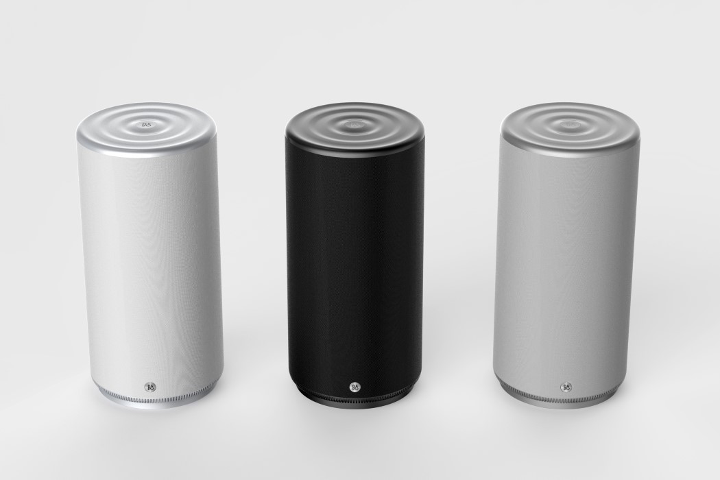
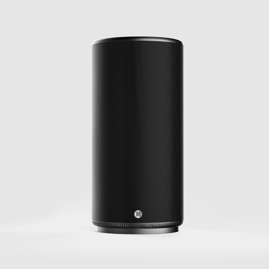
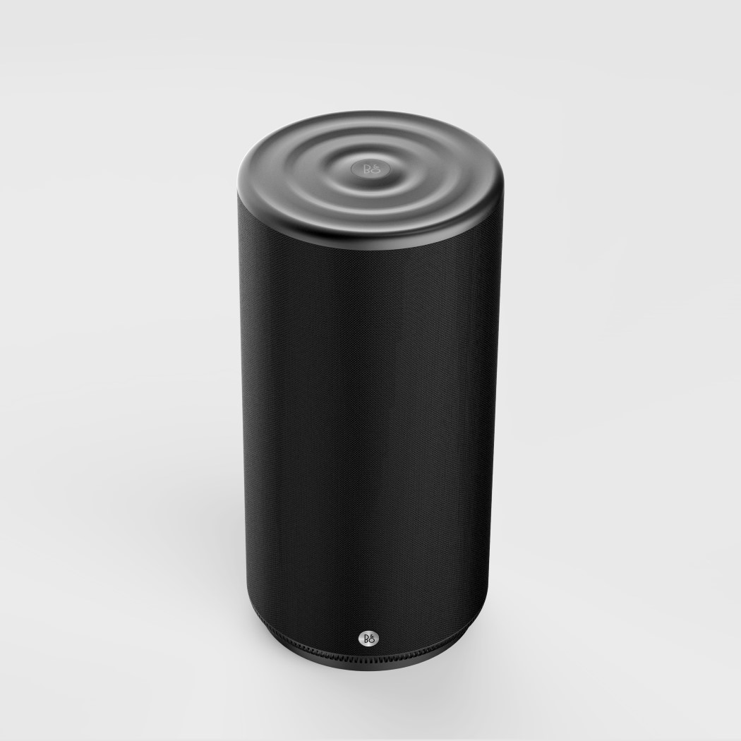
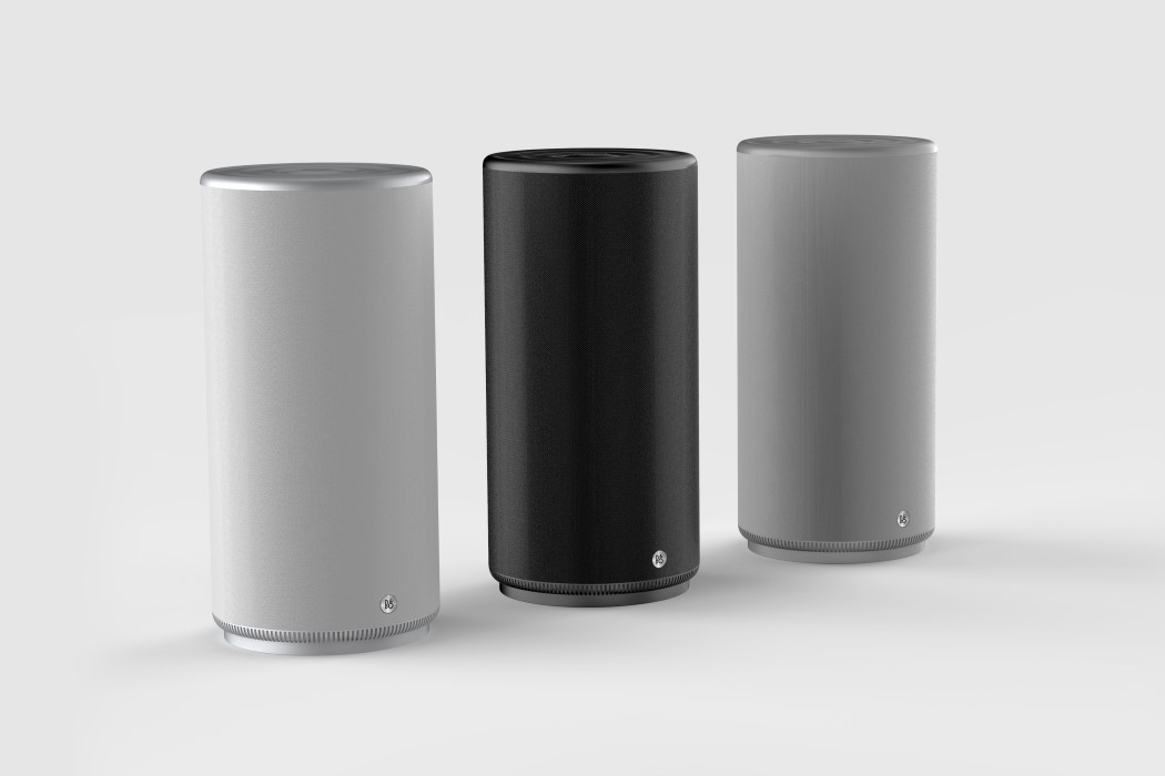
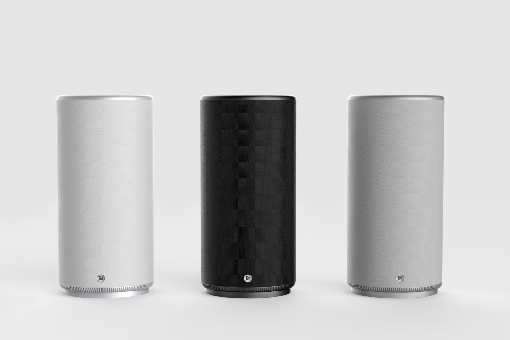
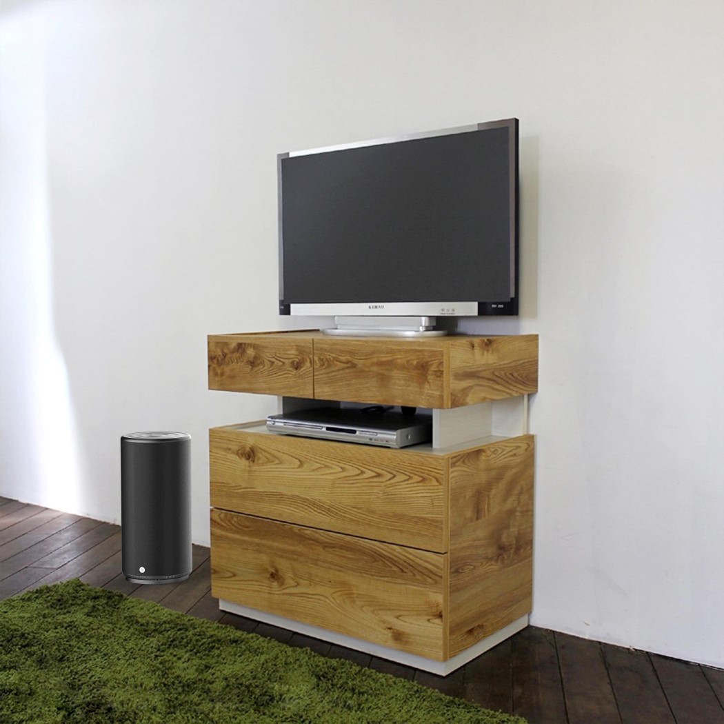
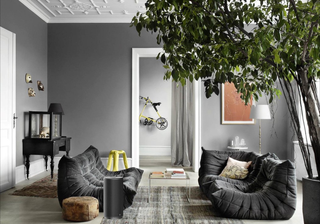
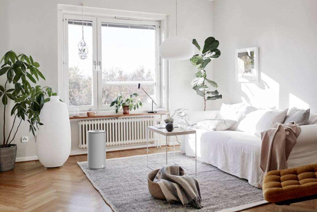
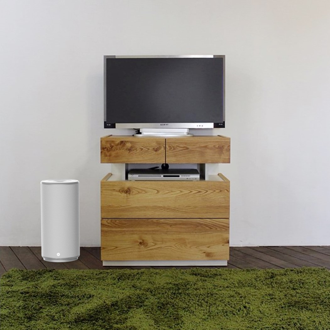
Bang and Olufsen are known to make some quirky looking hi-end speakers, but the Beoplay M6 isn’t one of them. On the contrary, it was built to integrate into households rather than stand out. The cylindrical (Apple’s iMac, anyone?) speaker packs some punch and can be used as a single unit, or with the BeoLink Multiroom functionality to pair itself with other M6 speakers around the house.
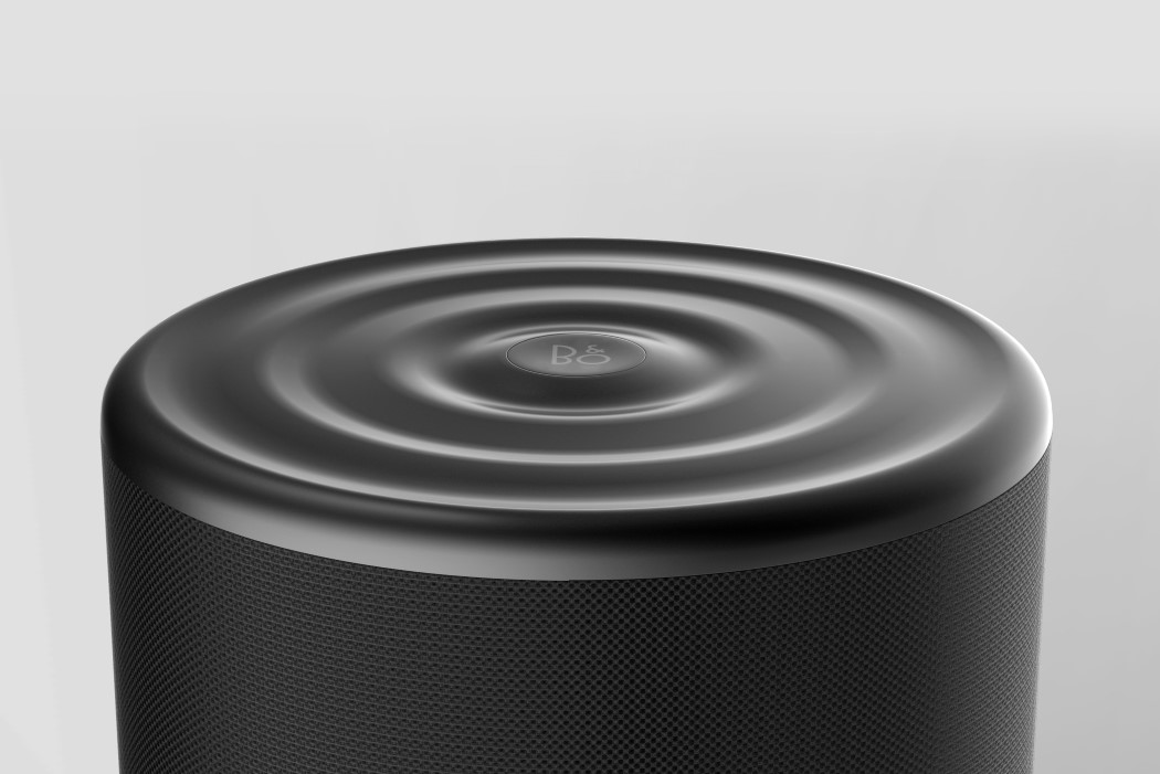
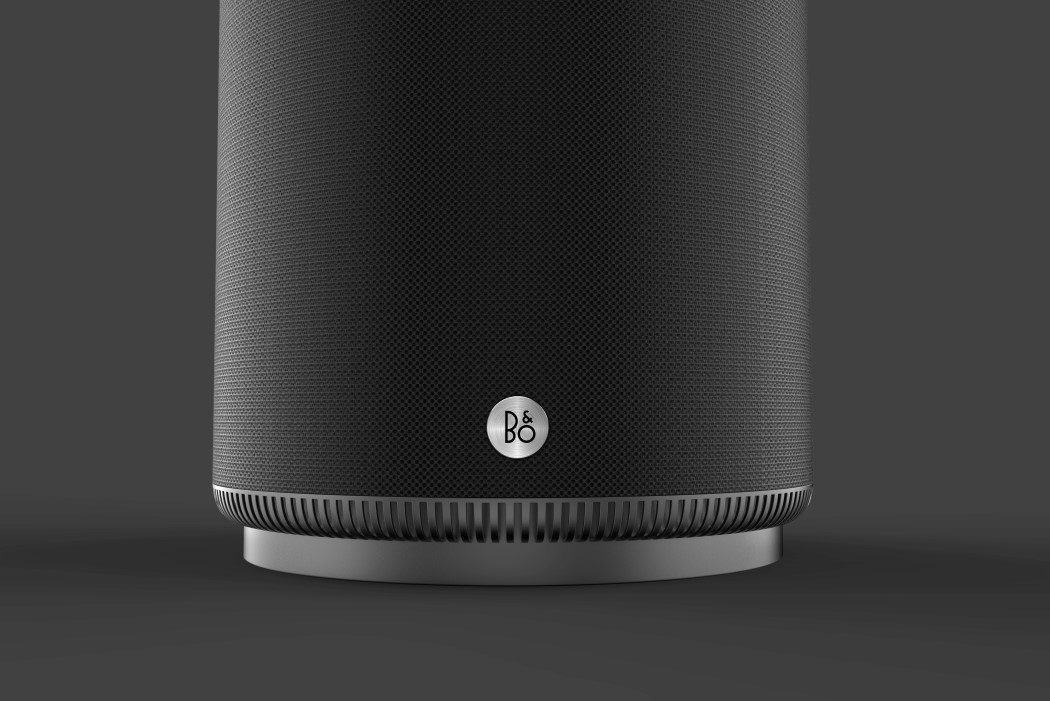
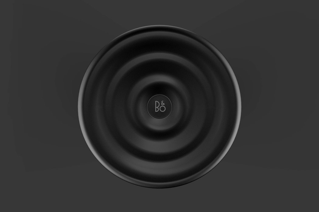
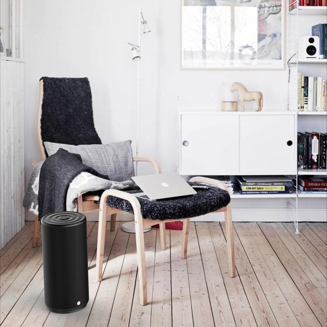
What the M6 does differently in form, it makes up for by sticking to a premium color palette that’s familiar to B&O’s visual language. Usage of matte plastic and matte metal with a stylishly woven fabric gives the speaker a more hand-made rather than an industrial, machine-assembled touch. My personal favorite is the design detail on the top of the speakers. At the center sits the B&O logo, with a ripple design spreading outwards, not only creating wonderful reflections and a great tactile feel, it also depicts the outward flow of audio waves from a central Bang and Olufsen logo. Beautiful in its symbolism!
Designer: Yomoto Mirou
![]()

