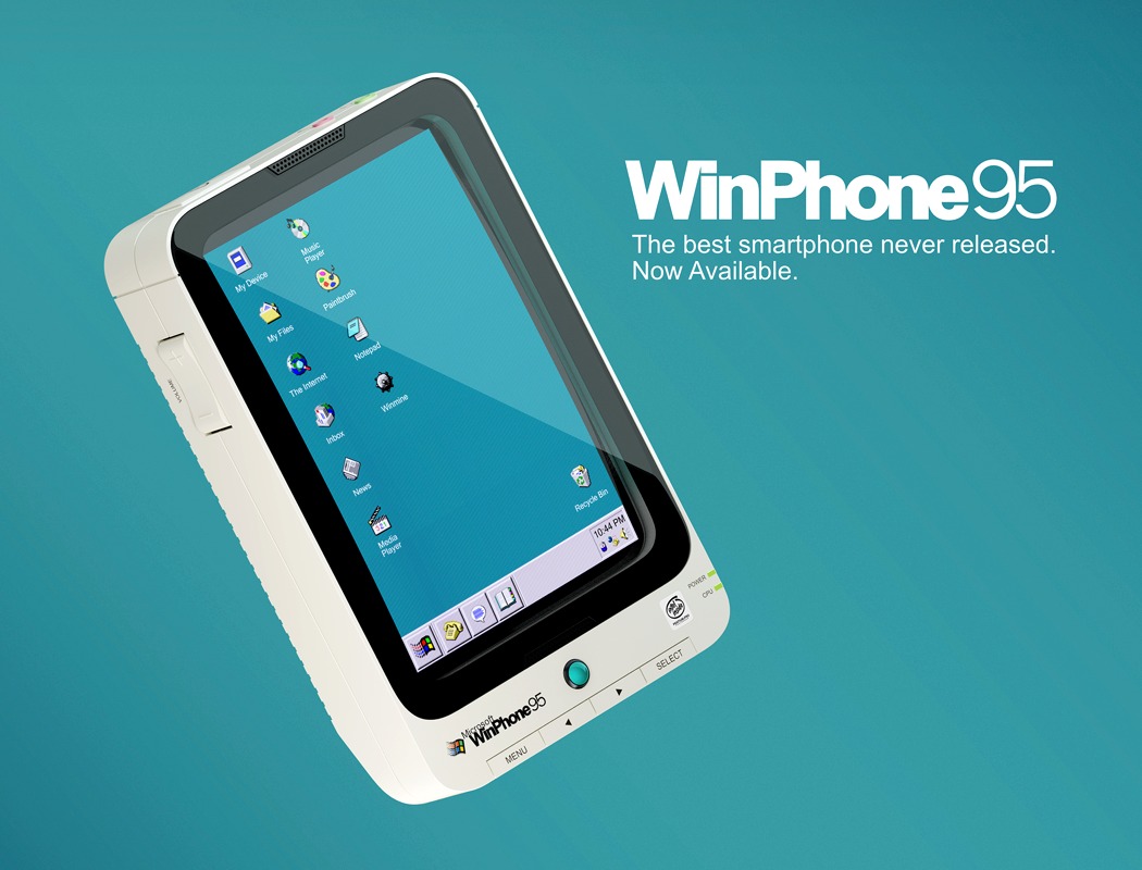
The smartphone market has always been a tough battle, not for the faint-hearted. Microsoft has never been the strongest in that battle, unfortunately – with the Microsoft Kin and not to mention the partnership with Nokia. Microsoft has fallen on some hard luck with the smartphone battle and failed various times to make a dent in the market, overly dominated by Android and iOS – more importantly, Samsung and Apple.
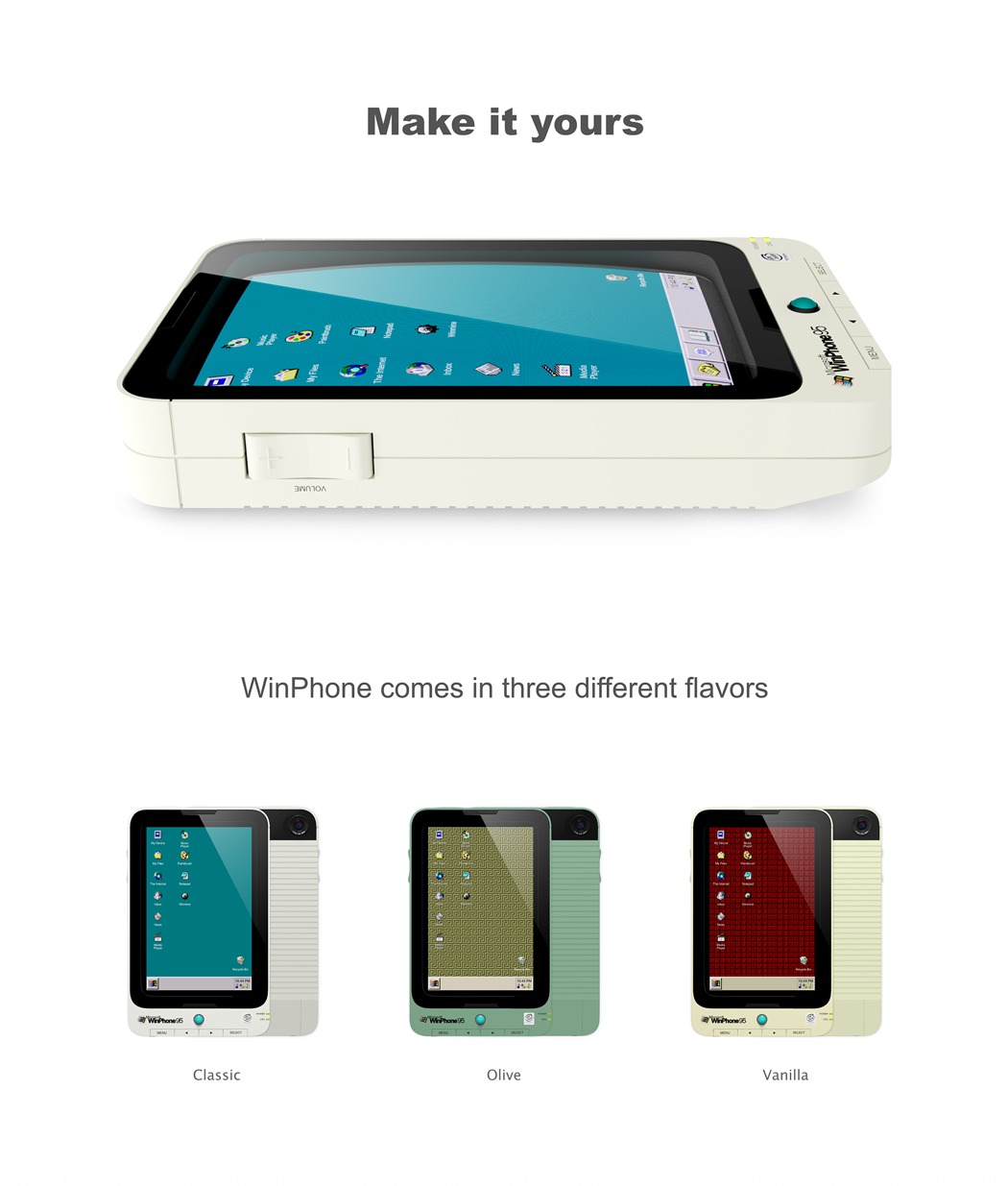
An interesting and unique perspective of – what would a Windows phone have been like if Microsoft made one that ran its wildly popular Windows 95 operating system? – was recently asked, and answered by UI/UX designer Henrique Perticarati. In order to complement the operating system, Perticarati gave the smartphone a familiar beige plastic, identical to those of the 80’s. The WinPhone 95 has a chunky and awkward brick aesthetic which is evidently the antithesis to today’s rectangular slab of metal in smartphones today. The WinPhone 95 humorously gives way to a small trackball in at the front for navigating through the Windows 95 interface.
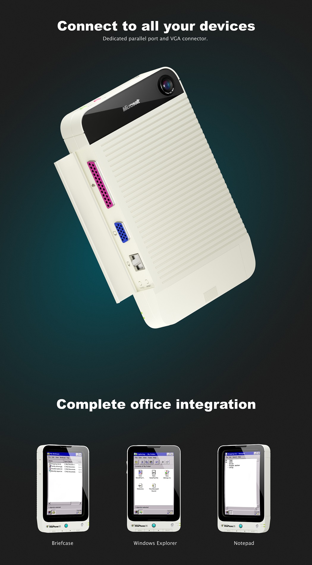
The WinPhone 95 pokes fun at the nostalgic attributes of Windows 95 with features like the ‘music library with CD quality audio’ or the fact that the WinPhone 95 has no USB-C or HDMI outputs, just good old parallel and VGA outputs for connecting all of your peripherals. Maybe this might give Microsoft the big win they’ve been looking for all these years?
Designer: Henrique Perticarati
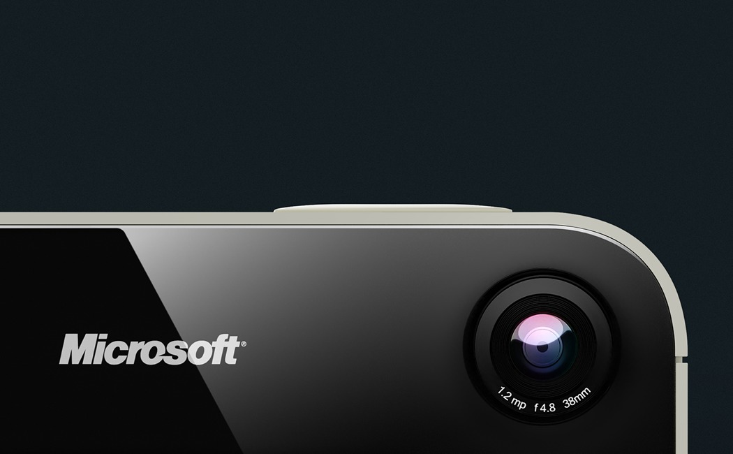
1.2 Megapixel photos with Sony Mavica Lens.
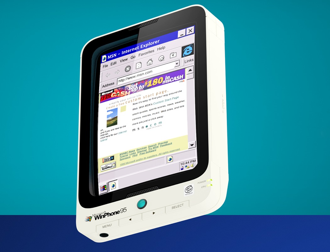
Browse the web with Internet Explorer.
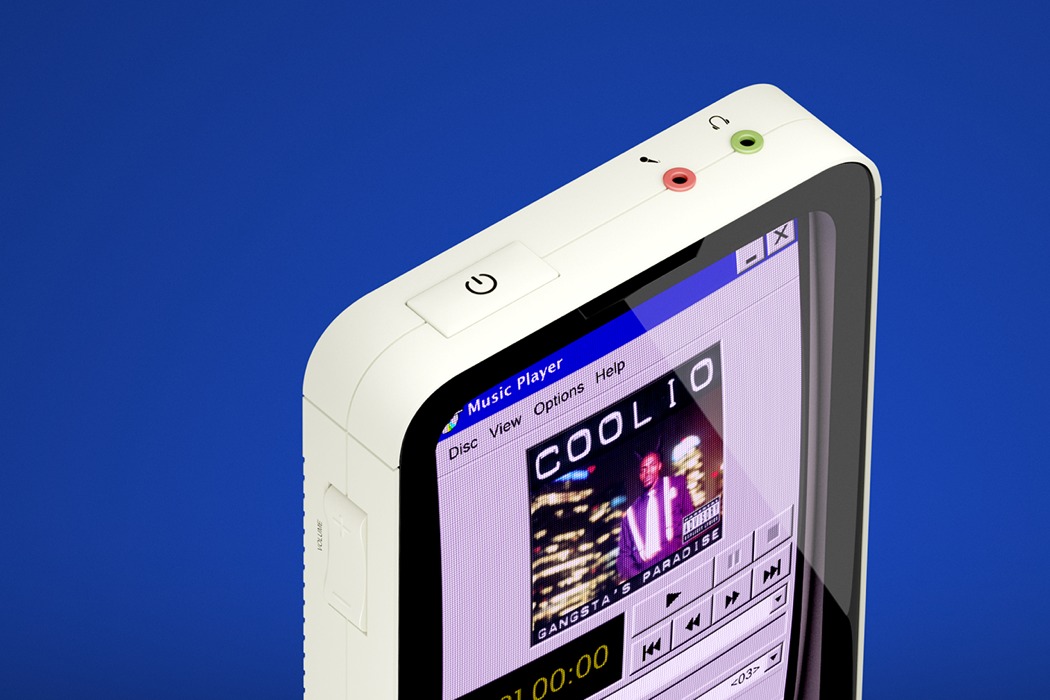
Listen to your music library with CD quality audio in Windows Media Player.

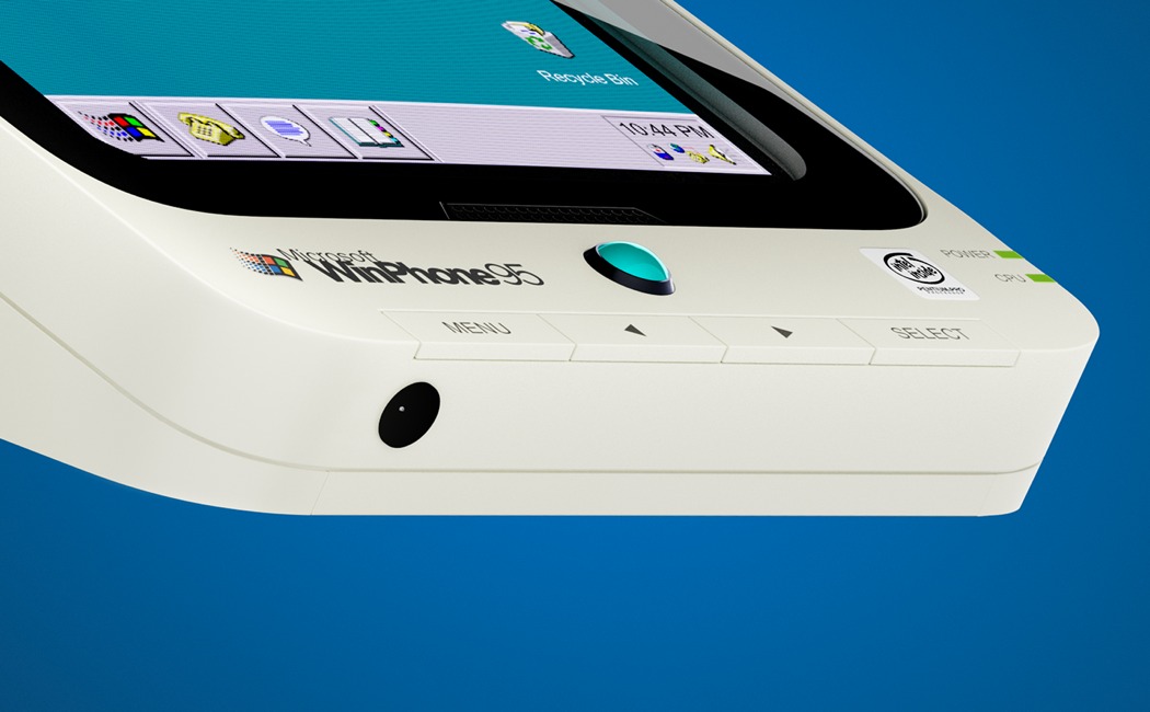
Multi task with the MS trackball. As you’ve always wished to.
![]()

