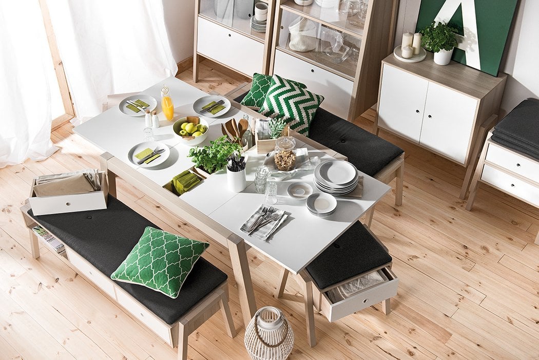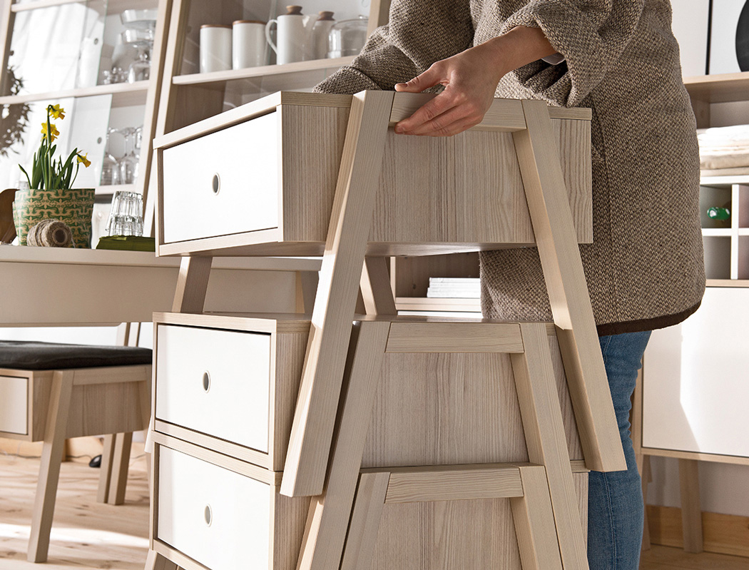
Now here’s an unusual post. I’m actually here with a varying opinion on this design. SPOT is a furniture series made primarily out of laminates, with each furniture item doubling up as storage. Now to the conundrum… Following a design language is quite challenging. Making a series of furniture that look like they’re a part of the same family is quite a design challenge and I commend that. However, the SPOT makes each room look the same. Almost all the furniture has an ‘A’ shaped cross section or design detail. This sets a visual standard, while also making items stackable. However individual rooms/spaces lose their charm and character with furniture that looks identical. So as a designer while I recognize a good attempt in following a visual scheme, maybe it’s been followed too much? Personally I would give each room a different flavor, because monotonous decor can be quite a drag.
But hey, that’s just me… I’d probably have the SPOT furniture in just one of the many rooms in my awesome imaginary future condo. 
Designer: Wiktoria Lenart


