The design field covers a wide range of industries, from physical artifacts of product design to the virtual elements of user interface design. It’s sometimes too easy to take for granted the importance of a well-designed user experience, but even the most beautiful computer or smartphone becomes just an expensive paperweight if the software running on it is unusable. Smartphone user experiences or UX have come a long way ever since the first iPhone and Android phones launched, embracing different aesthetics and design languages over the years. From skeuomorphism to minimalism, UX has taken inspiration from many beautiful things in our world, and OPPO’s latest iteration of ColorOS tries to take a page from the greatest artist and designer in the world, Mother Nature.
Designer: OPPO
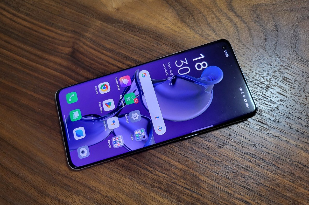
Smartphone UI designs have gone from trying to recreate physical objects in the digital realm to designing completely new metaphors that would be impossible to produce in the real world. The trend these days has swung towards minimalism, though the pendulum has started to move to a middle ground that adds a few embellishments to give a bit of life to what would normally be a literally flat design. This, in turn, has opened the doors to design languages that build on top of conventional minimalism, adding some character to a user interface.
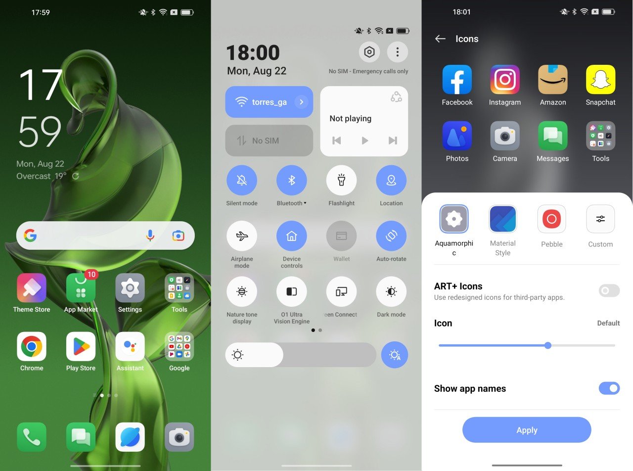
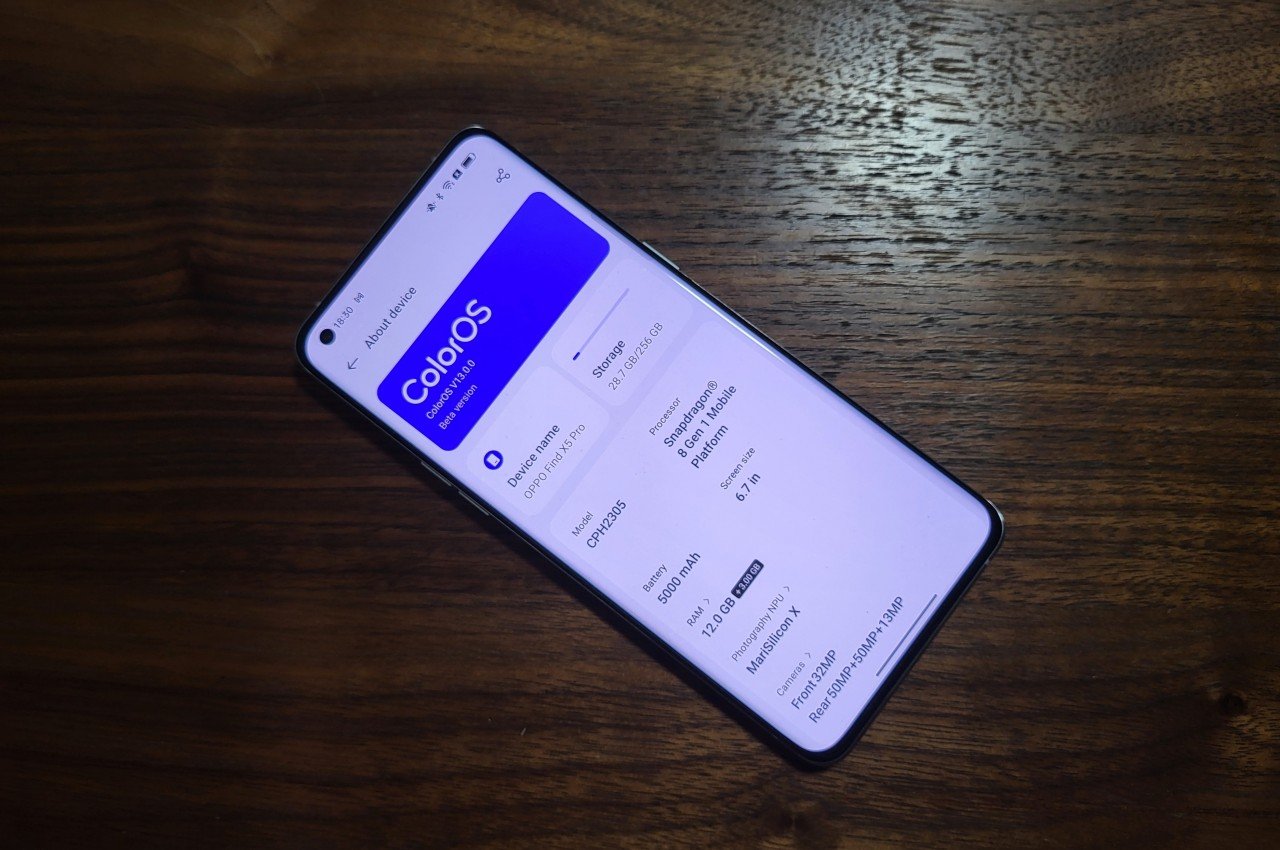
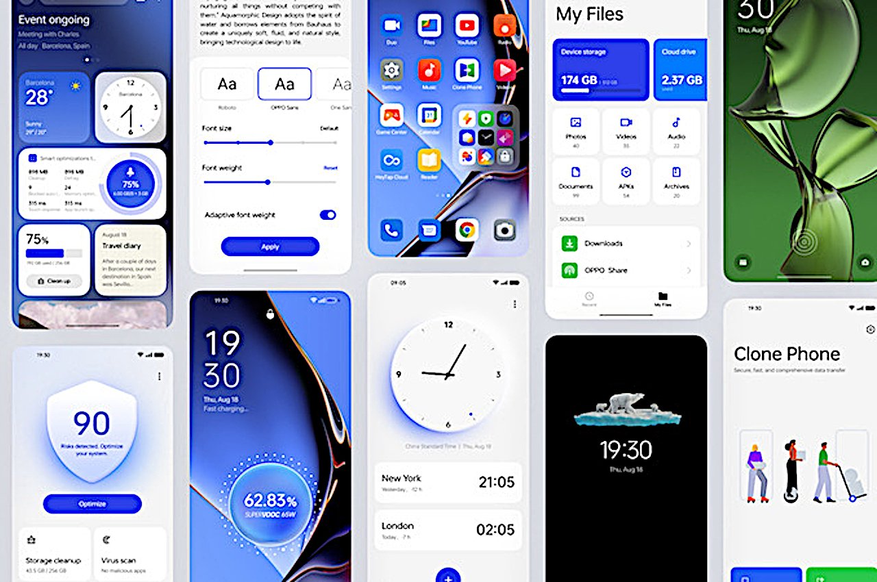
ColorOS 13, for example, introduces what OPPO calls its “Aquamorphic Design” language, taking inspiration from how water flows in nature. In its calmer state, water is naturally fluid, smooth, and compliant, preferring the path of least resistance and flowing around obstacles rather, slowly eroding rocks rather than trying to smash them. Whether intentional or not, it’s a fitting metaphor for the serene design language that OPPO adopted for its award-winning Find X5 Pro flagship earlier this year.
In practice, this Aquamorphic Design manifests itself in colors, shapes, and animations that feel smoother and more natural. The default color scheme, for example, tries to take hues from dusk at sea level. Icons are larger but also have smooth rounded corners as if they were pebbles picked up from the banks of a gently flowing river. Transition animations between various parts of the phone are also smoother and more fluid, trying to imitate the natural cadence of water rather than something as simple as a timer. Many people take animations for granted, and some even despise them as a waste of CPU time or battery, but properly designed animations actually help our brains form associations when parts of the screen move around. After all, nothing in real life just pops up out of thin air, something that would be jarring to our minds, whether physical or digital.
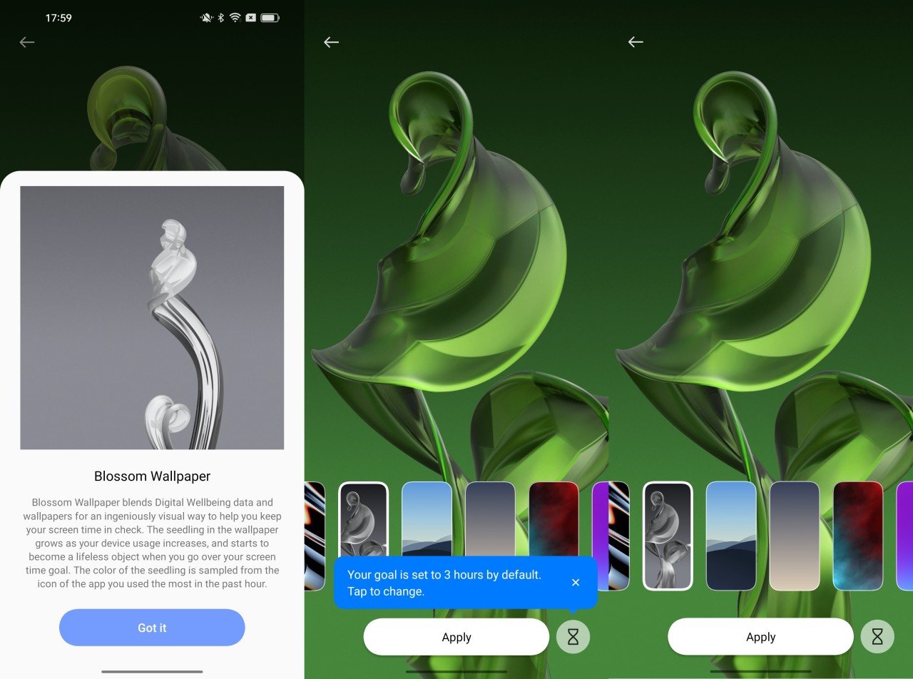
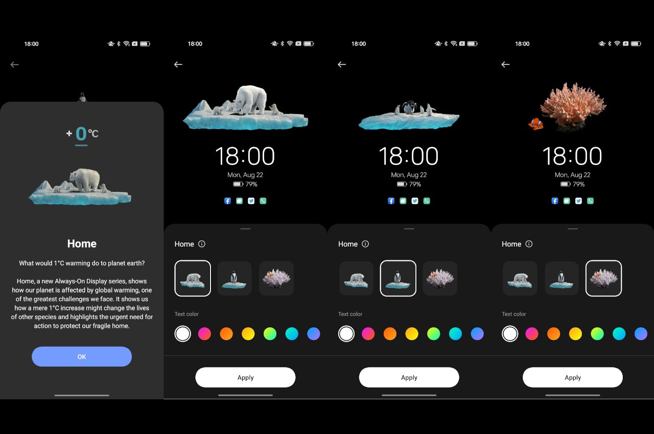
OPPO ColorOS 13’s nod to nature doesn’t stop with its appearance. A new Always-on-Display feature called Homeland, for example, tries to raise awareness of how even a minute change in temperature caused by global warming could affect wildlife. The Blossom live wallpaper, on the other hand, ties the idea of growing a plant with your screen time. If you go over your set screen time, the plant stops growing and starts to wither.
On the technology side, ColorOS 13 promises not just smoother animations but also more efficient battery usage. In addition to a 30% reduction in power consumption with Always-on-Display mode, this version of OPPO’s Android user experience tries to save as much battery as it can, which means fewer charging times and longer battery life. These may sound like minor improvements, but they are still small steps forward that increase a phone’s longevity and sustainability in the long run.
The post OPPO ColorOS 13 brings a touch of nature to its smartphones first appeared on Yanko Design.


