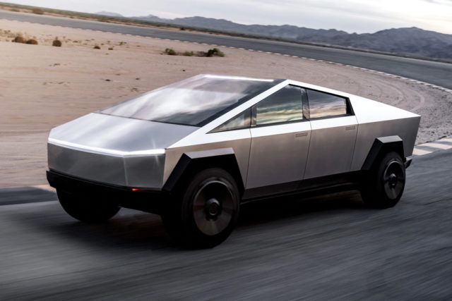
A whole day (and a half) after I called the Cybertruck a Toblerone on wheels, here’s a more detailed breakdown of the Tesla’s launch of the new Cybertruck, and why (as a designer, and not a customer) I still don’t like it. My opinion, if definitely more nuanced, still pretty much remains unchanged in its essence.
The most popular professionally circulated adjective to describe the Tesla Cybertruck has been ‘polarized’. It’s perhaps the most appropriate term to use. You don’t appear for or against the Tesla Cybertruck when you, as a publication, use the words “feedback has been polarized”. I, on the other hand, decided to call it the worst designed truck in recent automotive history. In hindsight, a rather swift judgment on my part. Mea culpa. I was clearly a part of this polarized demographic.
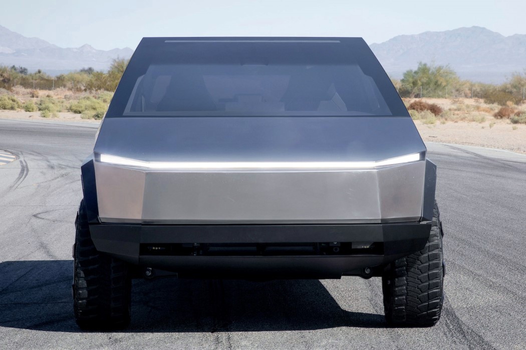
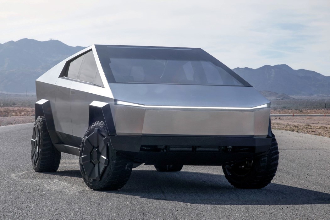
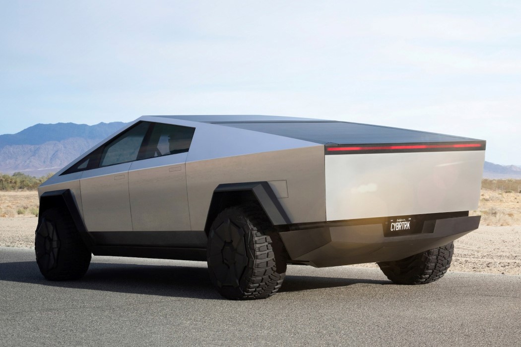
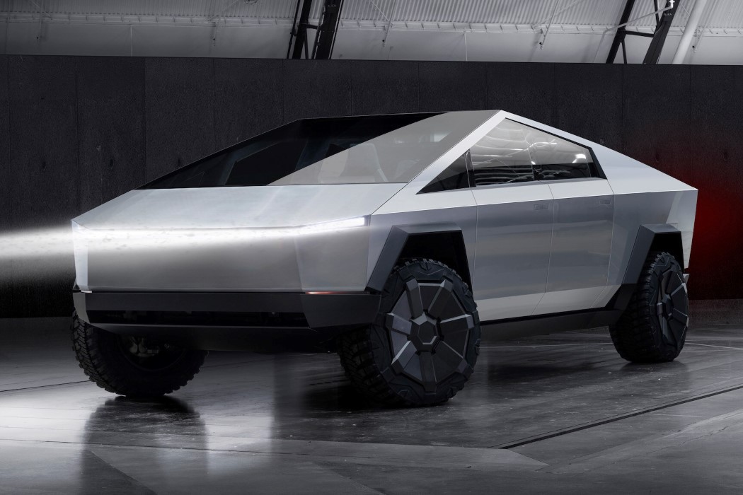
A lot of reflection and analysis later, here’s the problem though… I still don’t like the Cybertruck. It’s perhaps best described as being somewhere between avant-garde and incomplete-looking. You see, path-breaking designs or aesthetic overhauls are often reserved for concept cars (since they have little bearing on current world applications and scenarios) and not production-ready cars meant for consumers. The Cybertruck breaks the mold by being both ‘for consumers’ and outrageous looking and historically, that sort of radical change has rarely worked in any industry, be it tech, automotive, or even fashion. There’s often a sweet spot, an Overton window of aesthetic acceptance, that designers tend to look for when they make something new, trying to reach a stalemate between futuristic and familiar. The Cybertruck blatantly disregards the evolution of a hundred years of truck design to usher in the future, it looks nothing like a truck but still decides to use the word truck to describe itself. Moreover, the use of a strictly low-poly aesthetic tends to come off more as lazy than as revolutionary.
Among things that disappointed was also the Cybertruck’s insipid color choice. The plain sheet-metal grey, coupled with the simplistic sheet-metal design gives the Cybertruck the appearance of being ‘incomplete’ or half-designed. The Cybertruck is made from a special stainless steel alloy that almost completely resists any dents or dings when struck, even violently, by a jackhammer. To preserve (and better showcase) this feat of strength, Tesla missed an incredibly important opportunity in considering a wide variety of paint-jobs for the Cybertruck… because the steel alloy doesn’t scratch or dent, but automotive paint is sure to chip. This particular trade-off is what left me and a lot of other people feeling that the end-product was lacking. I mean even Tony Stark saw the importance of giving the chrome-grey Mach 2 Iron Man suit its signature red and gold paint job.
Elon’s elevator pitch involved showing three trucks from existing brands side by side and removing their logos to show how similar they look. The Cybertruck was his way of creating something nobody has ever seen before, and if that alone is justification for the truck’s strangely angular design, then so be it. My dislike, purely from the fact that I exist outside Elon’s perceived Overton window, is then justified too.
Make no mistake though… this doesn’t take away from the fact that the Cybertruck is an incredibly advanced automobile. It’s made from the same metal used to make spaceships, can stop 9mm bullets, drive uphill while towing a Ford F-150 truck that’s accelerating in the opposite direction, and hit top speed faster than a Porsche 911, all while being 100% electric. It has a spacious backbed complete with a shutter-style cover on top and a ramp concealed within its rear tailgate. The backbed even has its own charging outlet that lets you charge Tesla’s ATV right in the back of the truck… The Cybertruck is literally a power-bank on wheels! Apart from the slightly problematic Armor Glass demo (and there’s a wonderful WIRED article explaining with scientific accuracy as to why the glass broke), the Cybertruck is, on paper, a star performer… It just happens to also look less like any vehicle I’ve seen on roads and more like a silver Toblerone on wheels… and since buying a car is also heavily influenced by emotion, the Cybertruck gets a no from me.
Plus, if you haven’t noticed yet, the Cybertruck doesn’t come with any side-view mirrors… a feature so integral to road-safety and consumer-friendly car-design that it alone should be enough to reject the Cybertruck at first glance.
It’s easy to like or dislike the Cybertruck, but when push comes to shove, the only number that will matter will be its sales. More than 1.5 million pickup trucks were sold just this year alone. Will the Cybertruck somehow make its mark in pickup sales when it hits the road in 2021? Will it and its damage-proof outer body smash through the negative feedback and the vast expanse of internet memes? Only time shall tell.
![]()

