Goethe’s words “I call architecture frozen music” couldn’t ring more true for these 20 structural marvels. If architecture truly is frozen music, this article is a mixtape of 2017’s greatest songs.
A part of A’ Design Award and Competition‘s winner list, these buildings are awarded for the uniqueness of the project, social impacts, environment friendliness, energy utilization, and other project-specific criteria. Ranging from conceptual designs to residential units, to spas, offices, museums, and retail spaces, the A’ Design Award covers architecture in its entirety, aside from a wide roster of other categories. Not only does winning an A’ Design Award look great on an architect’s resume, it also brings a lot of repute and focus to the work, uplifting its value!
Architecture remains one of the most popular categories at the A’ Design Awards, receiving entries by the thousands each year. Here are a few favorites that we wish we had enough money to afford!
If you’re an architect looking to participate in the A’ Design Awards this year, click here to register. Hurry, the deadline is March 30th!
01. Hotel Pino Nature by Studio ZEC

Built on a mountain, the Pino Nature Hotel’s shape also makes it look like amountain range! Made to suit a snowy environment, its steep roofs make sure they never collect snow, while the front glass facade allows visitors to admire the impeccable view!
02. Manshausen Wellness Spa by Snorre Stinessen
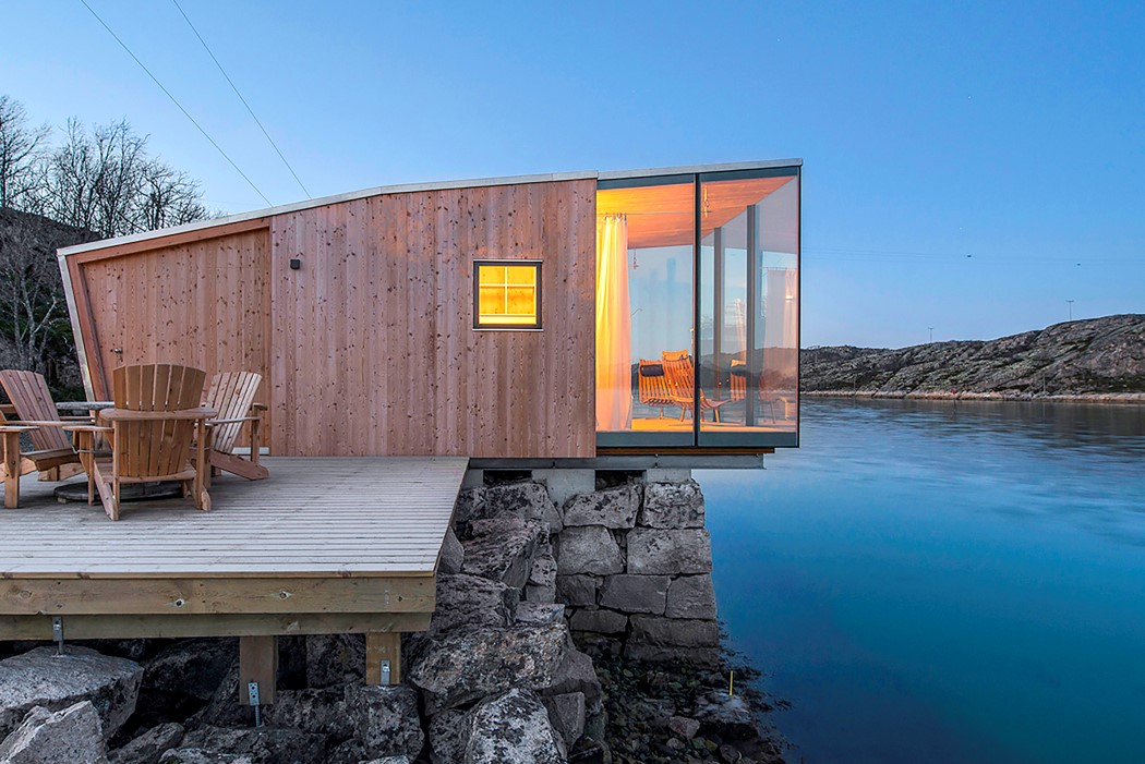
You don’t require much therapy at the Manshausen Wellness Spa by Snorre Stinessen. It cantilevers over a precipice, giving you an unconditionally beautiful balcony view of the vast and calming sea. That’s pretty much all the therapy you’d need!
03. Punjab Kesari Headquarters by Amit Gupta: Britta Knobel Gupta
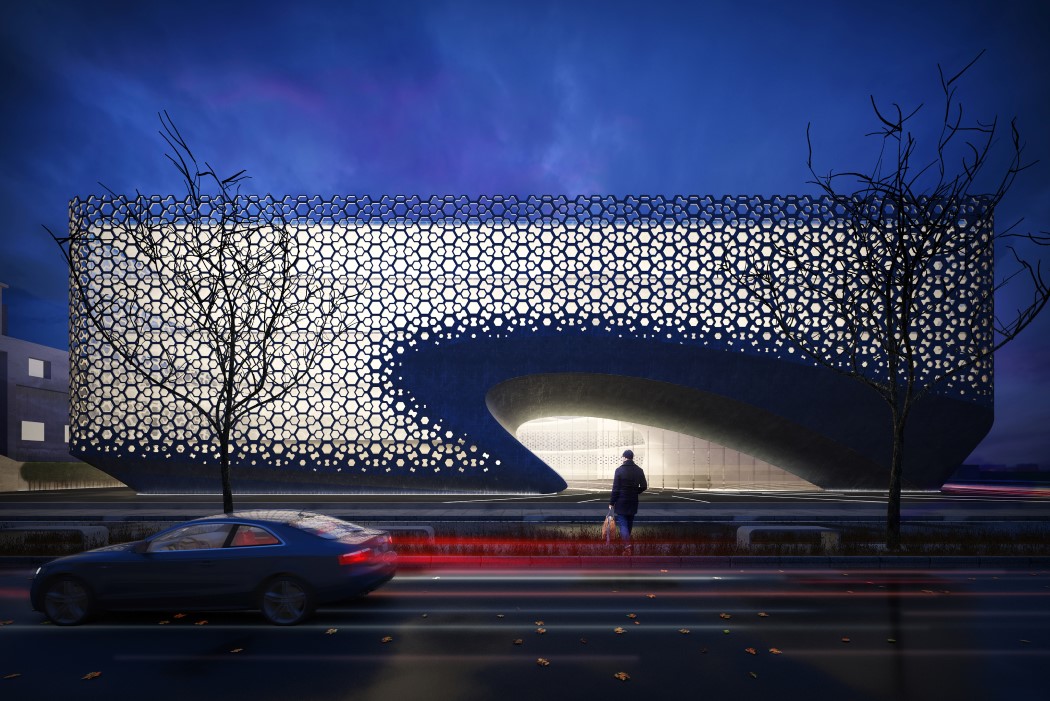
Built for one of India’s leading state-level newspapers, the Punjab Kesari’s new headquarters looks absolutely like a work of art. The use of a ‘jali’ facade helps bring a cultural touch to the otherwise modern architecture, indicative of the newspaper, which is seamlessly blends culture and future.
04. Horosho! Shopping Mall by Iq Architecture Studio

You’re likely to get lost in this shopping mall because you’re busy admiring its hypnotic architecture. Designed on a site that’s filled with otherwise drab looking residential buildings from the 80s, the Horosho! shopping mall tries to look dynamic… by literally looking dynamic! Designed with no two floors looking the same, the building sports an interestingly organic design that looks like pages of a book being turned.
05. White Church by Jingye Li

Clean on the outside and on the inside, and beautiful throughout, the White Church is everything a church should be. I especially love how the walkway has a gothic door/window shaped outline thanks to the metal column that travel from the floor to the ceilings. What a wonderful place this would be to get married at!
06. Keiun Building by Kensuke Aisaka
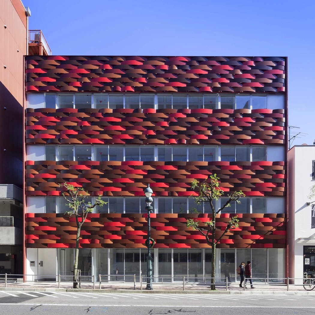
Made to look like the building was woven together, rather than built, the Keiun Building has a beautiful aesthetic and employs earthy colors that are rooted in Japanese Culture…. namely Akane-iro (madder), Ebicha-iro (reddish brown), Hiwada-iro (dusky red), Bengara-iro (Bengal red), and Kuri-iro (maroon). Designed to give one a quick, seductive taste of Japanese culture, the building is located right beside the Olympic stadium!
07. Fuyi River Sales Center by Kevin Chang
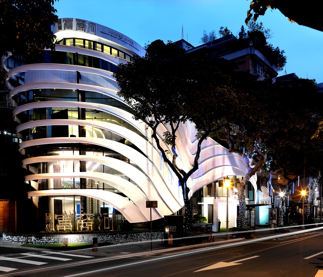
Taking inspiration from the seashell, the Fuyi Rive Sales Center stands out in its neighborhood by differentiating itself from the rest of the architecture in the area. The curved elements come made from white metallic sheets that shift both in width and pitch with a nonlinear rhythm to provide sunlight for the interior space as well as to give the building an iconic appearance from both inside and out.
08. Damavand House by Hossein Shirazian

Irregular, dynamic, and unique, the Damavand House cuts itself with vertical, horizontal, as well as diagonal lines. The white lopsided frame makes the house stand out from afar, while we personally love the way the designer made use of different colored woods to give the otherwise regular parts of the building some pizzazz too!
09. Chongqing Wanda Velodrome by Wanda CPRI & GDAD
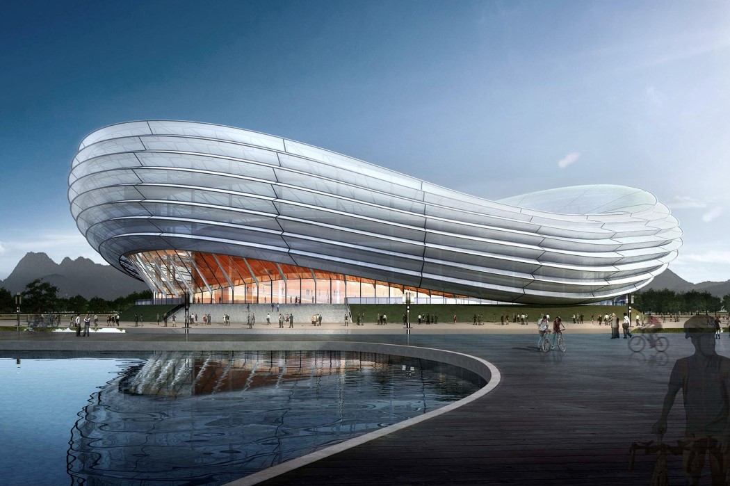
The Chongqing Wanda Velodrome takes inspiration from oriental culture, citing the Chinese lamp as direct inspiration for its aesthetic. Designed to be a cycling stadium that can also be used for other sporting activities, the entire stadium actually lights up like a lantern too, with different colors every time there’s a different sport played inside!
10. Urban Canvas Facade Installation by Hyunje Joo, Munhyung Lee
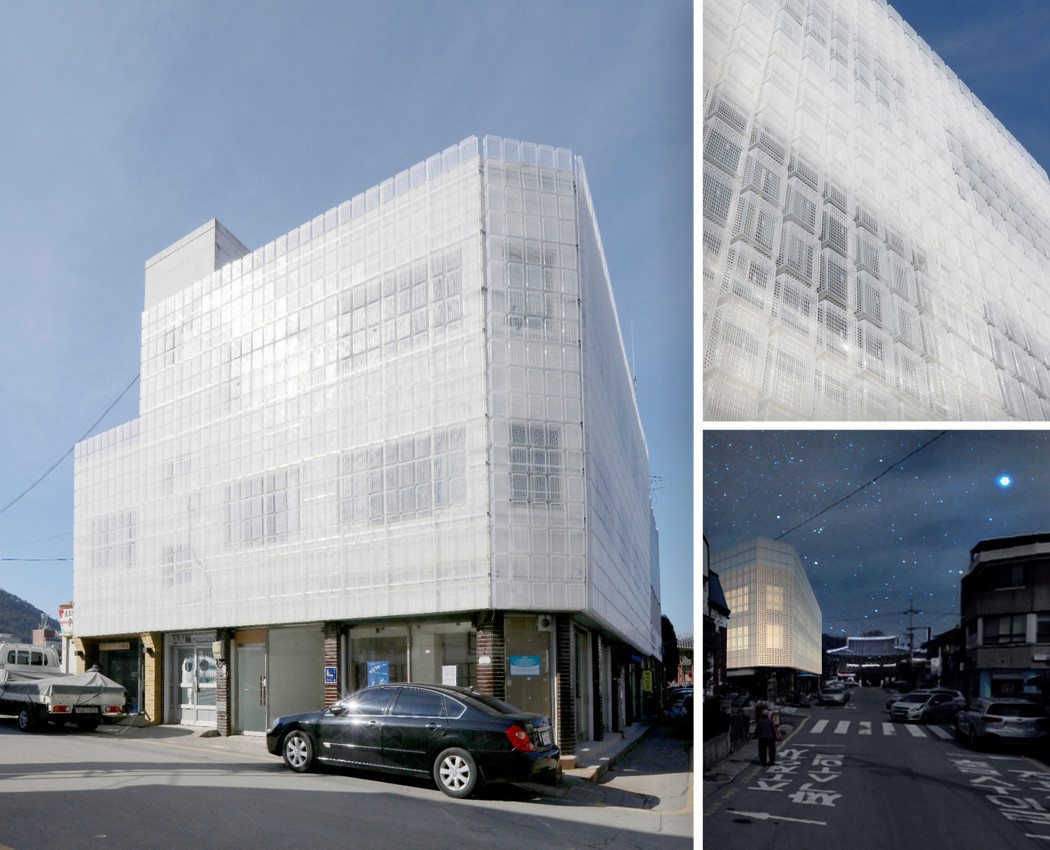
Perhaps the most unusual building to make it to this list, the Urban Canvas Facade is completely lined with translucent shopping baskets from top to bottom. I’m not really sure whether to react positively or negatively, but the building has my attention! Looking like it’s wrapped in bubble-wrap, the building has this texture that is sure to make passers-by take second and third glances. I can say with some surety that it surely looks interesting at night when the lights inside go on!
11. The Bad Cafe by Nuru Karim – Nudes

From one strange facade to another, the Bad Cafe’s most characteristic wall sports a strange undulating pattern created by individual pipelike projections coming out from translucent white tiling. Designed to look like the undulating microtexture of the skin, complete with pores, the Bad Cafe is a rejuvenation cafe that combines health food and yoga to cleanse one’s skin as well as one’s insides. What looks like a crazy pattern on the outside even translates to its inside, since the tiles are actually translucent, allowing you to see the shadows cast by the pipes at different times of the day!
12. Flexhouse Residential building by Evolution Design
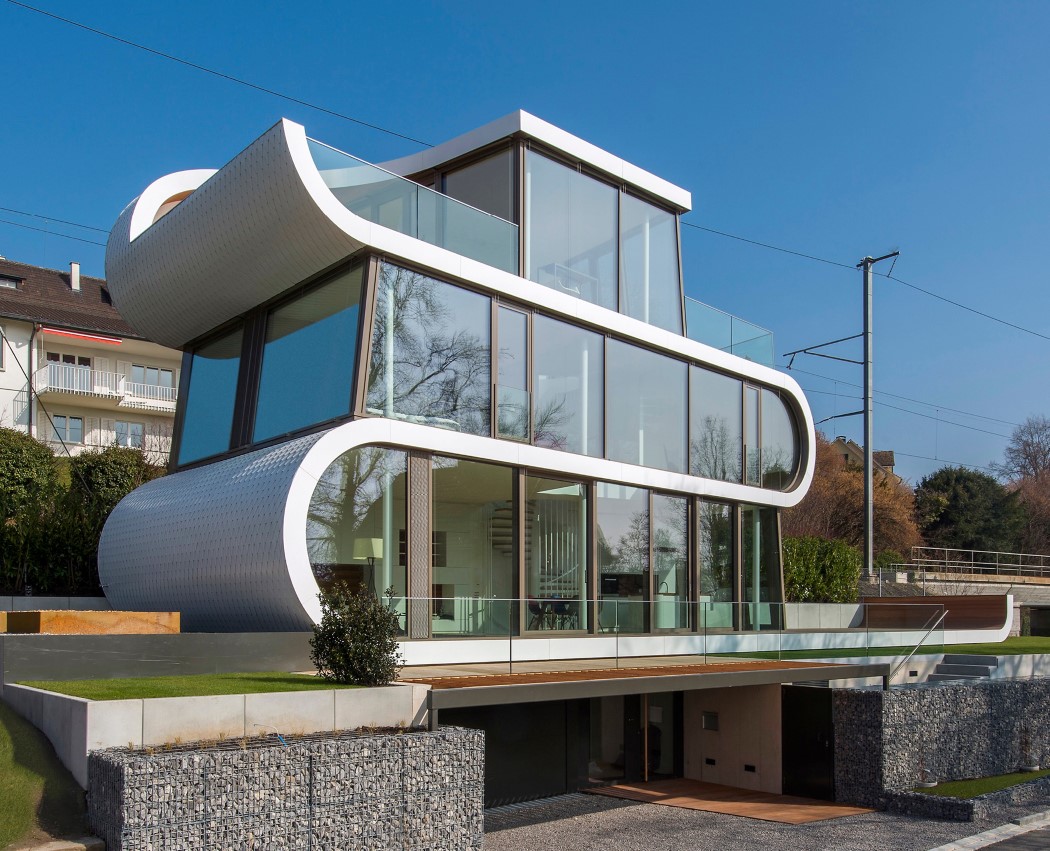
Architecture usually comprises multiple straight lines… the Flexhouse however features one singular curved line! Sitting somewhere in the vicinity of picturesque Lake Zurich in Switzerland, the Flexhouse is sure to add to the beauty of the neighborhood!
13. Pool House Residential by Priyanka Khanna
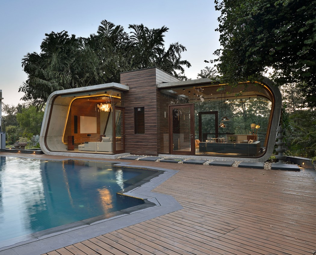
Ah, this is truly the life! Priyanka Khanna’s Pool House is peak life goals! The inspiration for the design being “pebble in the grass”, the Pool House comes with a pebble-esque outline, with glass walls on the front and back. One end overlooks a grassy meadow, while the other, an incredibly inviting swimming pool!
14. Carmen Hotel Boutique Resort by sanzpont
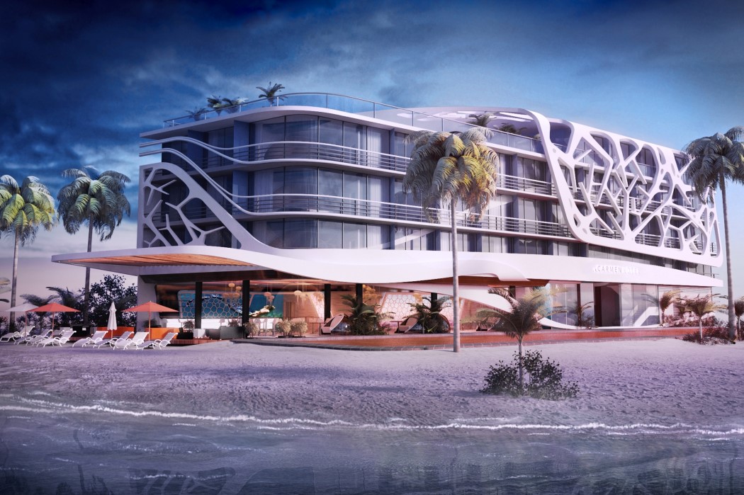
Marine life seems to be a dominating theme here, with the Carmen Hotel too taking inspiration from sea creatures. The hotel uses corals as its inspiration and ornaments itself with coral-like details. Situated right off the Caribbean Sea, I say it’s a perfect fit!
15. Lagos’s Wooden Tower by Hermann Kamte

Using Nigerian culture to adorn the building, the Lagos’s Wooden Tower comes with a clad that has deep roots in the cultures of the Edo, Yoruba and Hausa people of Nigeria. Along with the designs on the facade, the building comes with its share of flora, not only adding greenery to the atmos, but also a certain freshness and coolness to it.
16. Three cubes in the forest by Kotoaki Asano & Makoto Kosuda

Designed to look like cubes embedded into the soft ground, this movable pavilion is actually an interactive playing area for children. Built with benches on the inside, they’re perfect for children or even adults to play around in. Besides, they can easily be moved around, rearranged, or relocated by simply lifting them and moving them around!
17. Noor Island Park Park by 3deluxe architecture
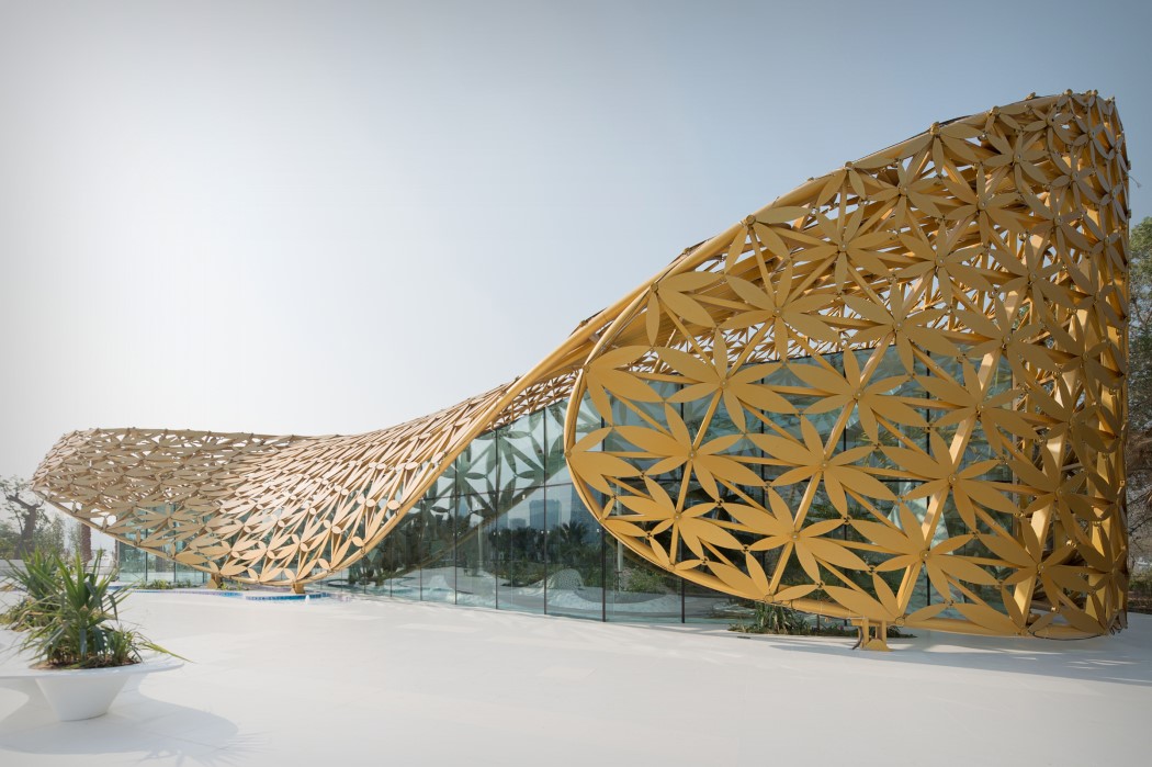
This sheet-metal ‘blanket’ on the Noor Island Park by 3deluxe architecture combines intricate Arabian ornamentation along with parametric surfacing. The result? A beautiful, organic, hypnotic piece of architecture!
18. Crab Houses Multifunctional complex by Dagmara Oliwa & Anita Luniak

These quirky buildings take inspiration from crustaceans and their overall shape. Designed to exist above the ground plane, the Crab Houses were made to look like crabs entering the sea of grass. Strange? Definitely. Appealing? For sure!
19. The Wave Tower Waterfront Residences by Ar.Girish Pillai

Taking the full advantage of the site location, the approach of the Wave Tower was to provide ample uninterrupted views to the sea. The design of the tower was inspired by the waves of the sea, which constantly changes its intensity running into the beach. As a result, the building looks like a part of the sea, while each floor has its own terrace, along with the sea-view.
20. Star Seafood Restaurant by Saber Sajadi
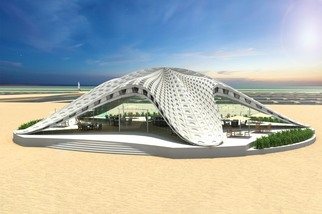
Our final pick for the architecture round-up is yet another marine-life inspiration. Somewhat following the statement “You are what you eat”, the Star Seafood Restaurant creates a new proverb… “You are WHERE you eat”. The seafood restaurant with its five-pronged design looks exactly like a massive 3D starfish from the top… and why shouldn’t it, right?!
Impressed? Inspired? Well then, go ahead and grab a spot for your own designs at the A’ Design Award and Competition. Don’t wait up! You’ve got till the 30th of March! Go take the leap, and we’ll see you on the other side!
![]()


