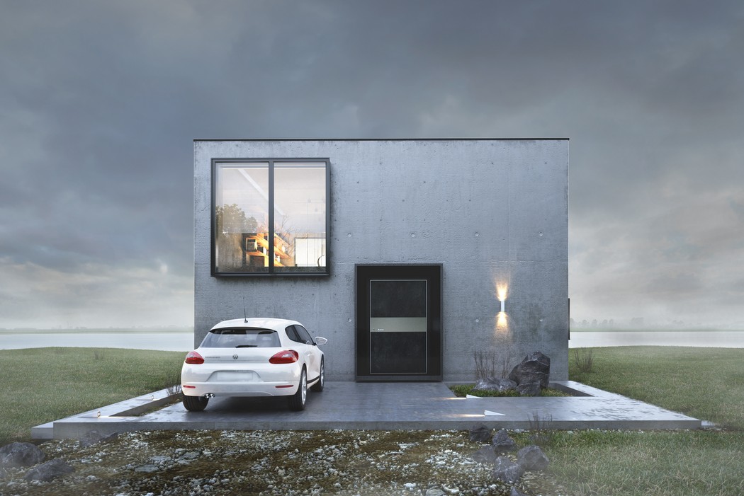
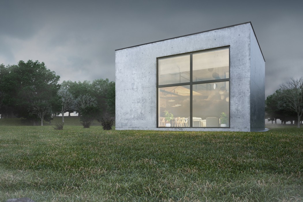
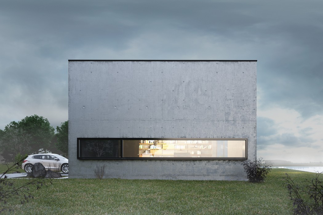
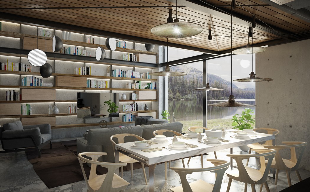
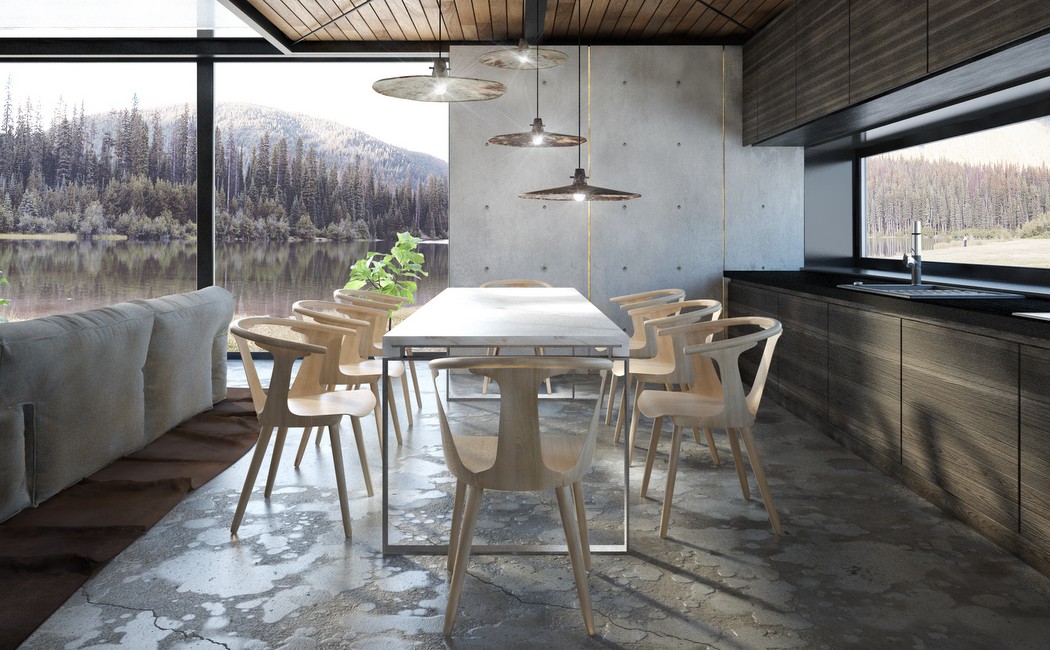
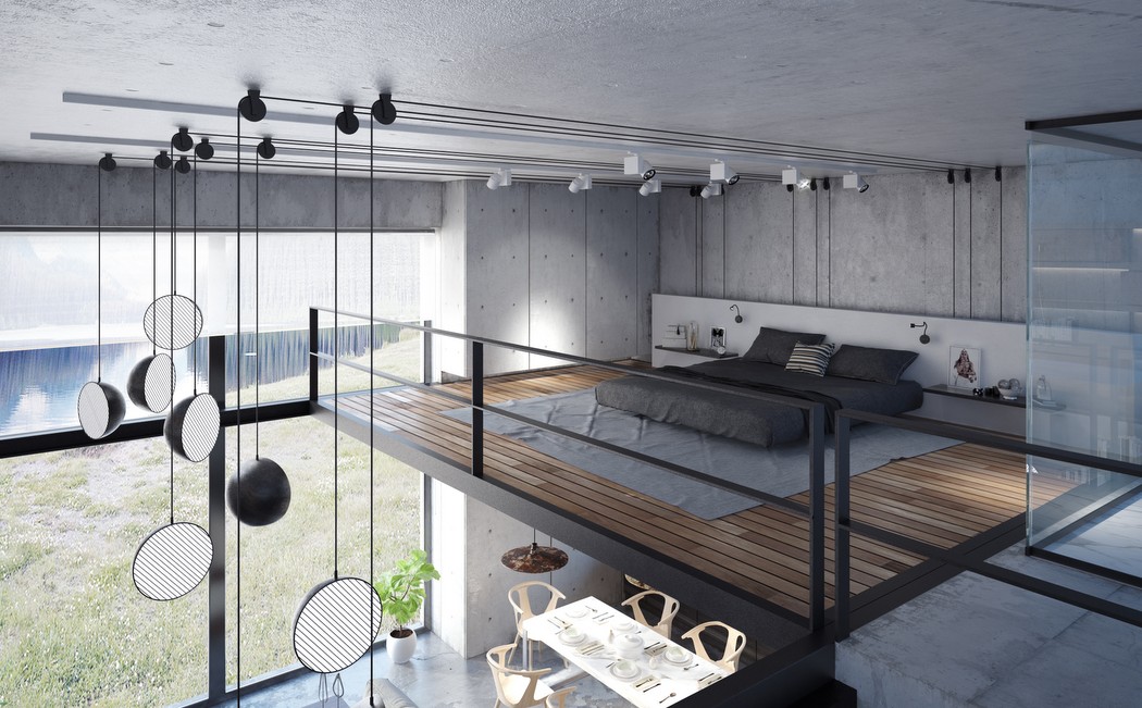
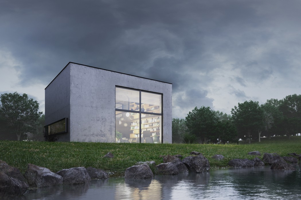
The KUBE home has a strangely rigid vibe. Appropriately named, it looks like a clean cut cube on the outside. However the inside tells a completely different story. While the outside looks cold and almost deterring to unwanted people, the inside is quite the opposite. There’s a stark change from the concrete gray on the outside to the warm incandescence of the inside. The layout has a studio apartment vibe to it with the entire space being loosely segregated into rooms.The lower level has a large living area space with an entire wall serving as a shelf (I see books, I drool). On one corner lies the dining area which connects to the kitchen. A balcony-style mezzanine floor serves as the bedroom with what I can only imagine is a rather lavish glass walled bathroom. Why not, I say! Maybe just shut the blinds when the guests come over?
Designers: Illya Rastvorov & Sergey Makhno Architects.

![]()

